![]()
![]()
|
|
|
|
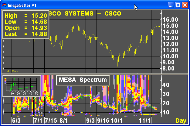
MESA Spectrum is the first study to look at because it provides a variety of subtle information regarding dominant cycle length, the purity and consistency of the measured cyclic activity, and whether the market is starting to trend or not.
For Ehlers’ discussion of the meaning and use of the spectrum study, see "Using the Spectrum to Identify Cycles and Trends," Chapter 10, pages 93-101, MESA and Trading Market Cycles.
The MESA Spectrum study has two parts: a colorful spectrum contour display, in the main study window, and a small line graph in a sub window at the left end of the main window.
The sub window graphs wavelength in bars on the horizontal axis against relative amplitude (in negative decibels or a related unit) on the vertical axis, at the current position of the prediction cursor. The graph shows the raw MESA cycle measurements over 30 bars, the same measurements used to generate the dominant-cycle wavelength and the standard prediction, calculated from the current position of the cursor.
The line graph is like a cross-section or "snapshot" of the spectrum contour plot—in fact, the spectrum contour is constructed from the data shown in the sub window. You can read the exact wavelength and the relative amplitude in negative decibels from the upper and lower figures in the lower right corner of the sub window by clicking in the sub window to create or move the sub window’s cursor.
Note that the highest point on the line graph does not always correspond to the dominant cycle as shown in the spectrum contour’s green dominant-cycle line and in the standard prediction, due to the smoothing used in calculating the dominant cycle’s wavelength.
The spectrum contour plot itself shows the same relative strengths of the different cyclic components shown in the line graph, but represents them with the color scale that appears on the left side of the line graph, and charts them against wavelength on the vertical axis. Therefore, the yellow parts of the spectrum (using the default color scheme) correspond to the strongest cyclic components, while the light gray parts correspond to the weakest color-coded ones. The green line in the spectrum indicates the dominant cycle’s wavelength.
As noted above, to read the current dominant cycle’s length, position the mouse arrow on the green dominant-cycle line at the level of the current bar, and read the wavelength from the vertical axis.
Next, look at the spectrum in the main study window. An ideal indication of cyclic activity would be a horizontal, straight green line with no other colors. This would correspond to a single, sharp peak in the line graph sub window, and it’s meaning would be a persistently dominant cycle of unchanging wavelength, with no cyclic components of significant strength at any other wavelength. Bright colors far away from the dominant cycle line, or high secondary peaks or plateaus in the line graph, correspond to significant cyclic components of multiple wavelengths, which suggests that the dominant cycle may not be dominant for very long, and therefore may not be worth trying to trade on.
In practice, a perfect indication is extremely unlikely. What you do want to see for a tradable cycle is a reasonably horizontal, preferably straight dominant-cycle line, with little color anywhere except right next to the green line. You are very unlikely to see this combination of features across the whole spectrum; but you do want to see it for a distance corresponding to at least half of the wavelength of the dominant cycle. Therefore, for example, if the dominant cycle’s length is 11 bars, you want to see at least six bars’ worth of encouraging spectrum display before judging it a positive indication.
Because the spectrum contains so much information, it is difficult to specify exactly what the minimum requirement for a positive indication is. However, there are some rules of thumb for each type of information presented by the spectrum display. In general, bright colors any distance away from the dominant-cycle line are worse than dark colors; more color showing is worse than less color showing; and more distance from the dominant cycle line is worse than less distance.
Finally, particular features in the MESA Spectrum studies can alert you to the onset of a trending mode in the market, and the end of a cycling mode. The clearest sign of such a shift can be seen in the sub window graph. If the line graph slopes upward to the top of the graph on the right side, this indicates that a trend is developing. When a trend is developing, when you move the main chart cursor from the left toward the current bar, the right side of the graph rises up to form such a sloping line. This phenomenon is called a "rising tail". The corresponding but less clear sign in the spectrum display is a lot of yellow right at the top of the spectrum display, over a number of bars, with gradually darker colors tapering off below it.
Determining Questions for MESA Spectrum
What is the dominant cycle length?
Over a range corresponding to at least half of
the dominant cycle length, does the spectrum display show a fairly horizontal,
preferably straight line with little or no color, especially bright color,
far away from the line? If
yes, this is a positive indication. If
no, try looking at another time- or tick-base or another instrument, or
wait for more favorable indications.
Alternatively, does the line graph in the sub
window show a sharp peak with the line near zero elsewhere? Does
this pattern hold for a number of bars to the left of the current bar
equal to or greater than half of the dominant cycle’s length? Does
the indicated dominant cycle length stay stable over that range? If
the answers to these questions are yes, this corresponds to the spectrum
display above and is a positive indication.
Does the graph show a line sloping up to the left, to the top of the graph? If you move the main cursor toward the current bar, do you see the right side of the graph rise to form such an upward-sloping line? If yes, this is a negative sign for a cyclic trading opportunity, but it is a positive sign that a trend is beginning and that trend-following trading opportunities may present themselves.
MESA Spectrum
The MESA Spectrum study draws the frequency of data in a cycle. The Spectrum study consists of two graphs, a spectrum for showing amplitude, and a line graph showing cycle length at the position of the chart cursor.
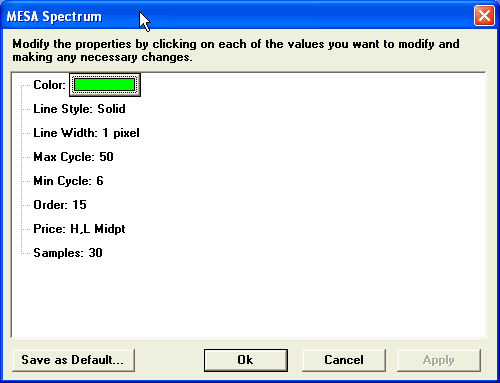
The MESA Spectrum study has six adjustable parameters:
Although these parameters are adjustable, John Ehlers recommends that you do not change them.
Parameters