4 CHARTS
Main Table of ContentsAspen Graphics provides flexibility in creating charts and combining charts with analyses. This chapter will describe the various methods in customizing charts.
1. Type cht_1
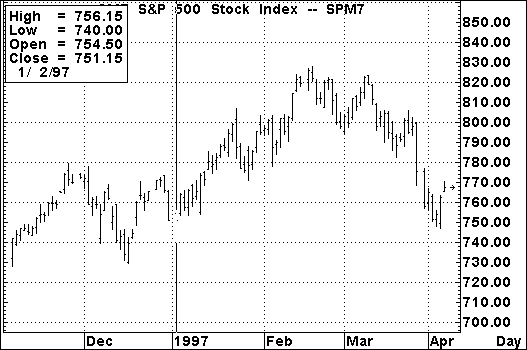
Figure 1
Chart Feature |
Function |
| Price Scale | The Y-axis displays a range of appropriate prices. |
| Price Arrow | An arrow at the price of the last trade. |
| Time Scale | The X-axis displays the appropriate time scale for selected time base. |
| Chart Cursor | The cursor is displayed as a vertical line that can be moved, bar-by-bar, across the graph. |
| Cursor Window | The cursor window displays all the data of the selected bar. |
| Time Base | Indicates the time increment of each bar. In Figure 1, each bar displayed on the chart represents one day of data. On Point & Figure charts, this figure indicates the box size and reversal. |
Table 1
The Chart Cursor Top of PageTapping the Left and Right arrow keys activates the cursor and moves it, bar-by-bar, across the graph. As the cursor is moved across the screen, the cursor window displays all the data of the selected bar.Moving the Cursor with the Keyboard
Top of Page
The cursor window is a true Aspen Graphics window in that it can be moved. It is different, however, in that it cannot be moved outside the chart window. To move the cursor window, follow these steps:
Removing the Cursor Window
The cursor display window can be removed by tapping the
To display an instrument in the active window, type an instrument symbol and tap the
Type ibm
Instruments can be charted in any intraday time frame from 0-1439 minutes. For example:
If the active window on the screen is a chart, a Graph Menu (see Figure 2) can be displayed by holding down the right mouse button and single clicking with the left OR by tapping the
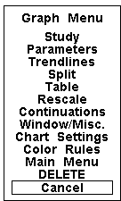
Figure 2
Selection |
Function |
| Study | Displays the Select Study menu to add studies to charts. |
| Parameters | Allows parameter changes on a study or chart. |
| Trendlines | Enters the trendline mode. |
| Split | Splits the chart. |
| Table | Displays a table window for the active chart. |
| Rescale | Displays the Rescale menu to allow changing x and y axis of a chart. |
| Continuations | Allows parameter changes of the continuation charts. |
| Window/Misc | Displays the Window Functions menu. |
| Chart Settings | Displays the Settings menu for the active chart. |
| Color Rules | Displays a list of available color rules. |
| Main Menu | Displays the Main Menu. |
| DELETE | Removes the chart from the screen. (Must be double clicked.) |
| Cancel | Closes the Graph Menu. |
Table 2
Changing Chart ScalesTop of Page
Once displayed, a chart’s time and price scales can be manipulated. Aspen Graphics enables adjustment of the automatic scaling of both the time and price scales.
This section will guide you through changing price and time scales. There are many different methods to scaling, but we will focus on mouse commands in this section. To change scales, follow these steps:
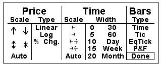
Figure 3
| Clicking onto either of the double-ended arrows will zoom or unzoom the chart. |
Chart Types Bar Charts Top of Page
A bar chart is the default chart type (see Figure 4). When an instrument is selected to be charted, it is initially displayed as a bar chart.
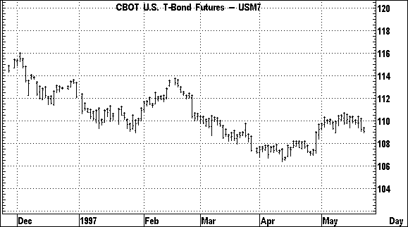
Figure 4
As a time period progresses, a vertical bar is drawn on the chart. A new bar will be drawn when the time increment of the chart is completed. For example, if a 15-minute chart is displayed, a new bar will be started every 15 minutes.
The bottom of the bar marks the lowest price during that time period. The top of the bar marks the high price of the period. The bar’s opening price is shown by a horizontal hash mark extending to the left The closing price is marked by a hash mark to the right.
Now that a bar chart is displayed, bring up the Settings menu by following these steps
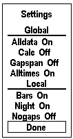
Figure 5
Selection |
Function |
|
GLOBAL Selections made under this heading will effect every chart within the Aspen system. |
||
| Alldata On/Off | If set to ON, any data that comes down outside
of the normal market hours will be placed on either the last bar of the day or the first
bar of the next day. This depends on which side of midnight the data was sent down. If set to OFF, any data that comes down outside of the normal market hours will NOT be displayed. |
|
| Calc On/Off | If set to ON, a study value will update with each tick. If set to OFF, a study value will update only at the end of the time period defined by the chart’s time base (i.e, day, week, 60 minutes or 10 ticks). | |
| Gapspan On/Off | If set to ON, any gap in a study on a chart will be spanned with a straight line. If set to OFF, any gap in a study on a chart will remain a gap. | |
| Alltimes On/Off | If set to ON, all of the trading times of all of the symbols on a chart are combined and used on the chart. If set to OFF, the chart only uses trading times that are common to all of the instruments displayed. | |
LOCAL Selections made under this heading will only effect the active chart. |
|
| Bars On/Off | If set to ON, bars will be displayed. If set to OFF, bars will not be displayed. |
| Night On/Off/Only | If set to ON, bars will be displayed for day and night trading. If set to OFF, bars will be displayed for day trading only. If set to ONLY, bars will be displayed for night trading only. |
| Nogaps On/Off | If set to ON, the chart will close up any spaces left by gaps in the chart. If set to OFF, any gap in a chart will remain a gap. |
| Done | Removes the Settings menu. |
Table 3
Historical Charts Top of PageAspen Graphics maintains data on all symbols on a daily open, high, low & close basis. Information from the data file is used to build historical charts. Figure 6 is an example of a weekly chart of June ‘97 US Bonds.
To change the chart to historical time frames follow these steps:
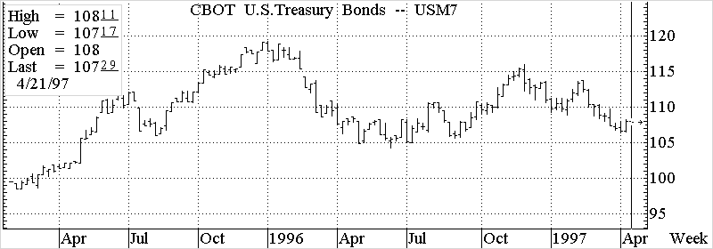
Figure 6
Displaying Expired Contracts Top of Page
As a futures contract expires, the daily data is archived by Aspen Graphics. To display a historical chart on an expired contract, follow these steps:
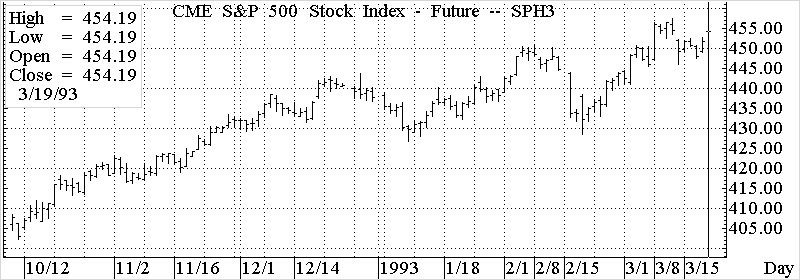
Figure 7
| When expired contracts are recalled on a chart, they are displayed in their correct position with respect to the current date. It may be necessary to shift the chart back in time to view the data. This can be done by using the Rescale menu, by turning Nogaps on or by using the BEFORE and AFTER commands |
Displaying Multiple Expired Contracts Top of Page
To display multiple expired contracts, type their symbols separated by commas and tap the
Example: ![]()
| Futures symbols are recycled every 10 years. Typing SPH3 will display the March S&P contract for 1983 and 1993. If the chart settings are set for NoGaps ON, both contracts will appear side by side. If the chart settings are set for NoGaps OFF, the chart will have a 10-year gap. |
Multiple contracts will be displayed in different colors and are aligned to the current date.
The expansion macro (@) can also be used to display multiple contracts on a chart. The @ sign tells Aspen Graphics to expand forward from the specified contract and display all symbols available (up to 20). Table 4 lists some examples.
| Macro Example | Function |
| SP@ | Displays all currently trading S&P contracts. |
| SPH3@ | Displays all S&P contracts since March ‘93. If the database has data as far back as 1973 or 1983, that data will also be displayed. |
| SPH3@5 | Displays the March ‘93 S&P and the next 5 contracts. |
Table 4
For more information on using the expansion macro, see the Multiple Instrument Charts section
Aspen Graphics provides the ability to construct continuation charts, which display the bars based on the entire history of the commodity. A continuation chart will display the lead month contract until its expiration, then switch to the subsequent contract. Figure 8 is an example of a continuation chart for the S&P 500 future.
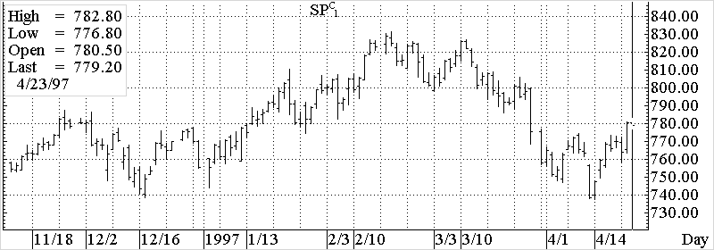
Figure 8
| It is not possible to display continuation charts in an intraday time base or in Nogaps On mode. |
The command used to draw a continuation chart varies depending upon the operating system of your computer. DOS systems will use the
DOS Systems Windows® Systems
sp
Typing these commands from the keyboard will display
Continuation charts can be based upon a specific month or forward contract. The following examples show how to display continuations for all March S&P contracts:
DOS Systems: Windows® Systems:
sp
Typing these commands from the keyboard will display ![]()
Continuations can also be drawn on forward months. To display a continuation chart based on the first contract out of the S&P’s, type sp
You can further customize a continuation chart by using the Continuation Setup Menu. This is the means of controlling how a continuation chart is constructed. To display the Continuation Setup menu (see Figure 9), bring up a graph menu, and single click with the left mouse button on Continuations
.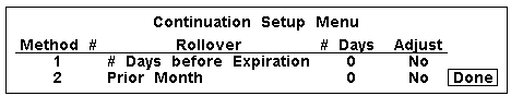
Figure 9
| Changing the parameters for the continuation will alter the display of your continuation chart. |
The Continuation Setup Menu contains four fields:
MethodTop of Page
Rollover Top of Page
| The Rollover default is set so that if contracts expire in mid-time frame (longer than a day), the next contract out is displayed. |
Prior Week
Prior Month
# Days:
Top of Page
This function allows the user to adjust the continuation chart to close up gaps created by price variations of different contract months. The Adjust function will change the actual values of the bars to smooth out the continuation.
Aspen Graphics enables you to display two types of tick charts:
Top of Page
Tick charts (see Figure 10) are different from bar charts in that they plot a point at each price that the instrument traded at during the time interval
.
Figure 10
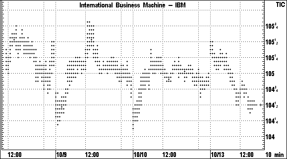
Using zero minutes as the time base of the chart will display another type of tick chart (see Figure 11). The zero-minute chart will plot a dot at the price and time at which the trade occurred. Note that zero minute charts do not have a regular time scale.
Type 0
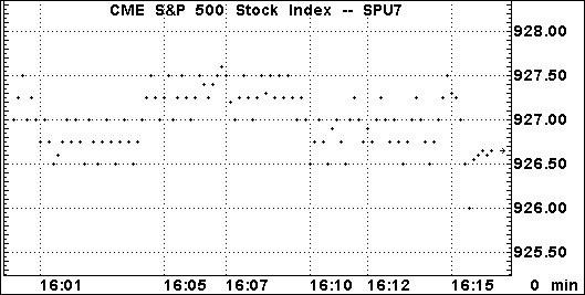
Figure 11
Equi-Tick Top of PageAspen Graphics enables you to display bars that consist of a fixed number of trades per bar, in contrast to a bar chart which displays a fixed time frame for each bar. Charts of this type are called Equi-tick charts (see Figure 12).
Figure 12
To display a 20-tick Equi-Tick chart, follow these steps:
The number 20 in the above command specifies 20 trades per bar. This amount will be displayed in the lower-right-hand corner of the chart. Any positive integer may be entered to display a custom amount of ticks per bar. Once a chart is in Equi-tick mode, typing a number will change the number of trades displayed in each bar.
To change an Equi-Tick chart back to a bar chart, follow one of these steps:
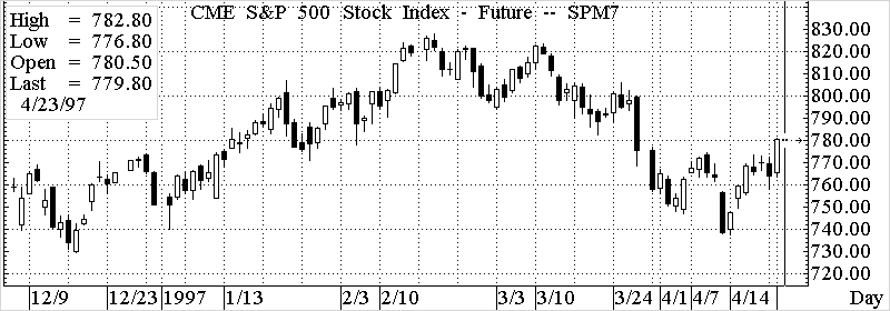
Figure 13
Setting Candlestick Colors Top of Page
The traditional candlestick chart uses filled versus empty to indicate whether the close was higher or lower than the open. Aspen Graphics improves upon the traditional candlestick chart by enabling you to add colors to the candlesticks. To add color to a candlestick chart, follow these steps:
Figure 14
| Color Rules DO NOT work on Candlestick charts. |
Point & Figure Charts
Top of Page
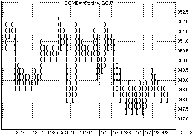
Figure 15
The contents of any chart can be changed to a Point & Figure chart by typing .p&f
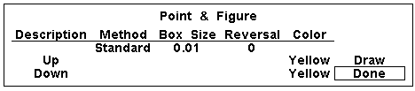
Figure 16
Aspen Graphics will not draw a Point & Figure chart until you specify a box size and a reversal amount. Once you provide these parameters, select Done, and the Point & Figure chart will be calculated.
Top of Page
The box size is a number you define as the minimum price move which will draw either an X or an O. In the chart in Figure 15, the box size is .3. This means that every time Gold gains .3 in price, an X will be drawn on the chart. Conversely, each time the price moves down by .3, an O will be displayed.
There are three types of Point & Figure charts: Standard, Original and Daily. Standard and Original are very similar. Standard allows a minimum reversal amount of one, while Original allows a minimum reversal amount of two. Daily Point & Figure charts allow you to analyze historical data on a P&F chart.
To enter a box size quoted as a fraction, follow these steps
Most of the traditional studies can be drawn on Point & Figure charts as long as these rules are followed:
To change a bar chart to a line chart, follow these steps:
| If you have a study or overlay on the bar chart, an Edit Studies
menu will be displayed. A single left click on BAR CHART will display the Bar Chart Menu. |
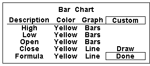
Figure 17
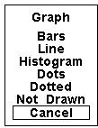
Figure 18
Aspen charts and windows can be overlaid onto other Aspen charts by typing .trans
The following is an example of how to use transparent charts:
- Type .dc
. A 15 min default chart will be displayed.
- Type ibm
- Type .dc
- Type djia
- Tap the
key one time to bring up a Graph Menu.
- Single left click on Parameters.
- Under the Colors category, single left click on each color, and select a color other than yellow.
- Single left click on Draw. The chart will change to the color you have selected.
- Single left click on Done. The parameters menu will disappear.
- Type .trans
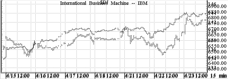
Figure 19
Gainers, Losers, and Highest Volume Charts
Top of PageAspen Graphics enables you to use a chart to display the greatest percent gainers, the greatest percent losers, or the instruments that have posted the highest volume. These three breakdowns are available only on an exchange basis.
| Before you can display any of these statistical breakdowns, you must bring up the exchange filter, and for each exchange being studied, you must set the Stat field to "ON". |
Charts containing gainers, losers, or highest volume instruments are multiple instrument charts. If the instruments trade out of range of one another, you can use percent change and logarithmic scaling for different perspectives.
Top of Page
nyse.g5
Any number from 1 to 20 can be used with this command. If no number is used, Aspen defaults to 20.
nyse.l5
Any number from 1 to 20 can be used with this command. If no number is used, Aspen defaults to 20.
Displaying Highest Volume Movers Top of Page
To display the top 5 most actively traded instruments on the New York Stock exchange, type the following:
nyse.a5
Any number from 1 to 20 can be used with this command. If no number is used, Aspen defaults to 20.
Multiple Instrument Charts
To chart multiple instruments on one graph, type in the symbols separated by a comma. i.e., sp#,sp#1 and tap the
To add instruments to existing charts, start with a comma, and enter symbols separated by a comma. i.e., sp#1,sp#2 and tap the
Aspen Graphics gives you the ability to split charts so that you can look at studies without interfering with the "presentation" of your bar chart. To make split charts, follow these steps:
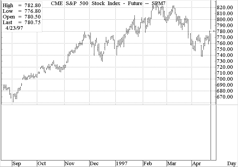
Figure 20
| For a complete explanation of the Select Study menu and Studies available in Aspen, please see the Studies chapter of this manual. |
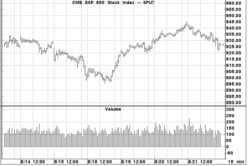
Figure 21
| You can split a chart as many times as is practical. Keep in mind that as you add splits to a chart that your computer will eventually reach a point when it cannot process color, and the chart will switch to monochrome. |
A chart header is a window which is attached to the active chart. When you change instruments in the chart, the chart header will display the change.
Any chart window or quote window can be made into a chart header. You can even create your own. In this section, we will turn a quote window, that comes with your system, into a chart header.
To make a window a chart header, follow these steps.
| It is important that you use the underscore (_) between the words Chart and Header. |
Every chart within Aspen Graphics can display a table of values. The table displays the high, close, open, and net of each bar to the right of the cursor. To display a chart table, follow these steps:
Figure 22
Top of Page
Tick correction for daily, weekly, monthly, quarterly and yearly charts must be corrected from a daily bar chart. To correct a bad tick on a daily chart, follow these steps:
The 110’23.![]() may be used
to enter in a fractional price. For example, if an instrument trades in 32nds, and you
want to enter the price in 32nds, insert the
may be used
to enter in a fractional price. For example, if an instrument trades in 32nds, and you
want to enter the price in 32nds, insert the ![]() between the integer and the numerator i.e.
between the integer and the numerator i.e.
Top of Page
Tick correction for tick and intraday charts can be done as follows:
Removing a Bad Tick
Top of Page
It is possible to remove a bad tick altogether. To remove a bad tick, perform these
steps:
To remove gaps in charts, perform these steps:
Some futures have two or more trading sessions. Aspen Graphics enables you to view instruments with or without the evening session trading. To set the sessions a chart will display, perform these steps:
| If no second session is set up for the instrument you have displayed, Aspen will inform you that no second session is available. |
The fix split feature enables you to adjust the historical data to the current price and volume ratio. To fix a split, follow these steps:
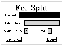
Figure 23
| You cannot fix a split the day the split happens. You must wait at least one day before it can be fixed. |
| Fractional splits cannot be entered as fractions or decimals within the fixsplit window. To correct a 1.5 to 1 split, enter a ratio of 15 to 10. |