6 STUDIES Main Table of Contents
STUDIES
Aspen Graphics comes with an extensive selection of indicators. This section will show you how to bring up these indicators, change their parameters, and apply them to your charts.
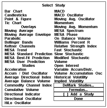
Study Menu Top of PageStudies are displayed on the screen by either choosing them from the Select Study menu or by typing the command associated with the study. To bring up the Select Study menu (Figure 1), type .study
Figure 1
The Select Study menu is divided into three sections. The first four selections in the Select Study menu are types of charts that you can display in Aspen. If you have a bar chart window on your screen, you can change it to a candlestick chart by selecting Candlesticks. The same can be done to change your chart to a Bar Chart, Point & Figure Chart, and a Tic Chart.
The next section of the Select Study menu is Overlays. Overlays are indicators that are superimposed on the chart. Multiple overlays can be displayed on one chart and can be fine-tuned to your specifications by changing the parameters.
Displaying an Overlay on a Bar Chart
Top of PageTo display an overlay on a bar chart, follow these steps:
Changing the Parameters of An Overlay
Top of Page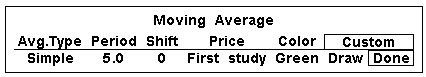
Figure 2
The third section of the Select Studies menu is Studies. The indicators in this group have their own scale and should be viewed in their own window. If a chart is highlighted, and a selection is made from the Studies section, the study will replace the bar chart.
Top of PageTo display a study on a chart, follow these steps:
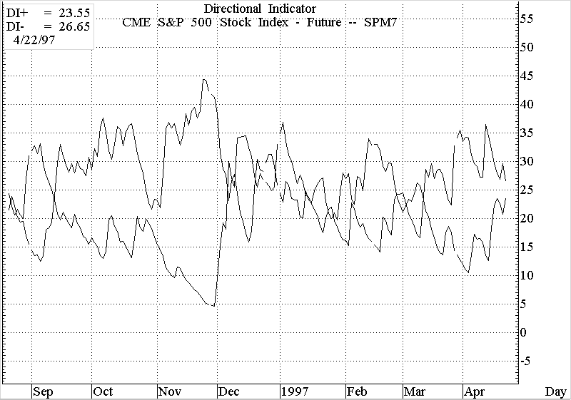
Figure 3
Changing the Parameters of a Study
Top of PageTo change the parameters of a study, follow these steps:
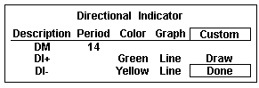
Figure 4
Displaying a Study on a Split Chart Top of Page
There are times when you may like to see both the bar chart and a study on the same page. One way to see this is to split the chart with the bars on the top and the study on the bottom. To put a study on a split chart, follow these steps:
| A chart can be split as many times as you would like. |
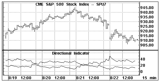
Figure 5
[ ] Add a Study
Top of PageAspen Graphics allows you to view multiple studies on a chart. To add an ADX study to a Directional Indicator, follow these steps:
Figure 6
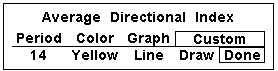
Figure 7
| Figure 8 was created using the parameters in Figures 4 and 7. |
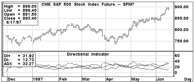
Figure 8
Charting a Study on a Study
Top of PageAspen Graphics allows you to calculate a study on a study by selecting First Study from the Price Menu. To calculate an RSI of a Momentum study, follow these steps:
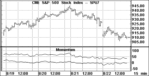
Figure 9
Deleting a Study
There are several ways to delete a study from a chart in Aspen. The method you use will depend on what other studies are also present in the chart window.
Removing an Overlay Study Top of PageTo remove a study which has been overlaid on a price chart (bar, tick, Candlesticks or Point & Figure), follow these steps:
Figure 10
If you want to delete a study window from a split chart (see Figure 9), highlight the window you wish to delete and type .delete or press
Some selections on the Select Study menu may be "grayed-out." These are optional studies which are available by subscription. Aspen Graphics has an optional DeMark Studies package. With DeMark entitlement, you will be able to select the DeMark Studies… field on the Select Study menu and display these studies on your chart. Please see the Aspen Graphics supplement for DeMark Studies for directions on their use.
MESA studies are a group of indicators developed by John Ehlers. Maximum Entropy Spectrum Analysis, or MESA, studies also have supplemental documentation.
The Implied Volatility study is available to those users subscribing to either the Basic or Aspen Options packages. Contact your salesperson for information on these supplementary packages.
Formulas Top of PageAspen Graphics also gives you the ability to create, customize, and chart formulas. The formulas in your Formula Listing which contain a (series) or (input) between the formula name and the equal sign will be displayed in this submenu. From the Select Study menu, single left click on Formulas . . . to access those custom formulas.
Description of the StudiesThe Overlays and Studies listed on the Select Study menu can be categorized into four groups:
| Moving Averages | Parabolic |
| Moving Average Env. | Keltner Channels |
| Bollinger Bands |
Overbought/Oversold Indicators: Top of Page
| Momentum | Modified Stochastic |
| A/D Oscillator | MACD |
| Acceleration | Williams’ %R |
| Fast Stochastic | MACD Osc. |
| Slow Stochastic | Relative Strength Index |
| Momentum | Commodity Channel Index |
| Moving Avg. Osc. | HiLo Oscillator |
| Directional Indicator |
| Directional Oscillator |
| Average Directional Index |
Activity Indicators: Top of Page
| Volume | Cumulative Volume |
| Open Interest | Volume Accum. Oscillator |
| On Balance Volume | Variable Acc/Distribution |
| Average Balance Volume | Historical Volatility |
The following section describes these indicators in more detail. They are arranged in alphabetical order. Examples of color rules and alarms based on these indicators are given at the end of each section. For more information on entering color rules and alarms, see the Formulas, Color Rules and Alarms chapter.
MESA, DeMark and Implied Volatility studies are not outlined here. They are available as optional packages which integrate seamlessly into the Aspen Graphics program. Each package comes with its own documentation detailing these studies. Contact your salesperson for more information.
Acceleration Top of PageWhat it Does:
Acceleration is the difference between the current momentum value and a previous momentum value. While a momentum study indicates the rate at which prices change, an acceleration study indicates the rate of change in momentum. When an acceleration study yields a positive value, prices are not only rising, they are also rising at a faster rate. When an acceleration study yields a negative value, prices are falling at a faster rate.
For information on how momentum is calculated, see the Momentum section.
Divergence between momentum and acceleration, or price and acceleration, are other uses of this study. If momentum is decreasing while acceleration is unchanged or increasing, momentum may soon be changing directions; the converse is also true.
Type of Study |
Keyboard Command |
It works best in...… |
|
| Overbought/ Oversold | .acc | Cash and Futures markets, all time frames | |
Table 1
How Aspen Calculates It:
Acceleration is:
Current Momentum - Momentum
n periods agoThe user determines how many periods should be used in each of the Momentum studies. This is done from the Period field in the study’s parameter menu.
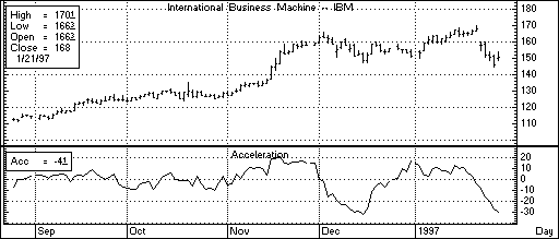
Figure 11
At the end of November and beginning of December on the chart in Figure 11, price was still rising but acceleration was falling. This divergence was a signal that the end of the uptrend was near. A high was soon hit, and price began to drop.
Default Parameters Settings:
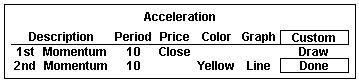
Figure 12
Custom Aspen Formula:
Accl(series,per=10)=mom($1,10)-mom($1,10)[per]
This formula, once entered in the Formula Listing, allows you to use Acceleration in color rules and alarms, as shown in the following examples.
| If charting this custom formula, make sure that Nogaps=On in the Chart Settings Menu. |
Color Rule Example:
if(Accl($1,10)>Accl($1,10)[1] and mom($1,10)<mom($1,10)[1],clr_blue,clr_yellow)
.This color rule will turn a bar blue when the 10-period acceleration is increasing and the 10-period momentum is decreasing. It will leave all other bars yellow.
Alarm Example:
chart((Accl(c#,10)>Accl(c#,10)[1] and Accl(c#,10)[1]>Accl(c#,10)[2])[-1],15,1,100,1,1)
The alarm will trigger when the Acceleration has increased over the last two periods. The alarm is based on 15-minute bars for the front month of corn.
Charting Setup Idea:
Oscillators, such as Acceleration, are sometimes graphed as histograms rather than as line charts. To draw this study as a histogram, bring up the Acceleration study on a chart. Bring up a Graph Menu, select Parameters, and then single left click on the word Line in the Graph field. Select Histogram, and then select Done.
A color rule can be written to display all positive values in green (or any other color) and all negative values in red by entering the following color rule:
if($1>0,clr_green,clr_red)
Accumulation/Distribution (A/D) Oscillator Top of PageWhat it Does
:The A/D Oscillator indicates overbought/oversold conditions by comparing "buying power" and "selling power" to the period’s trading range. This study was developed by Larry Williams and Jim Waters as a way of "normalizing" the relationship between the open and closing prices with the extreme prices for the period.
Type of Study |
Keyboard Command |
It works best in...… |
| Overbought/ Oversold | .ado | Cash and Futures markets that are trending. |
Table 2
How Aspen Calculates It:
The A/D Oscillator is calculated as follows:
Buying Power + Selling Power
2 * True Range
This study defines "buying power" as the difference between the true high (the higher of the current high or the previous close) and the period’s open. Selling power is defined as the difference between the close and the period’s true low (the lesser of the current low or the previous close).
The A/D Oscillator values are not smoothed by averaging the values of several periods (as with a moving average), so the oscillator often fluctuates wildly between 0 and 100. To make this study easier to read, a moving average can be applied to the A/D Oscillator, and overbought/oversold zones can be applied to this moving average.
Default Parameters Settings:
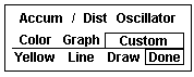
Figure 13
Custom Aspen Formula:
ADOsc(series)=100*(($1.thigh-$1.open)+($1.close-$1.tlow))/ (2*$1.trange)
This formula, once entered in the Formula Listing, allows you to use the A/D Oscillator study in color rules and alarms as shown in the following examples.
Color Rule Example:
if(ADOsc($1)>90 or ADOsc($1)<10,clr_red,clr_yellow)
This color rule will turn a bar red when the value of the A/D Oscillator is over 90 or less than 10 and leave all other bars yellow.
Alarm Example:
chart((eavg(ADOsc(lhq7),6)>70 or eavg(ADOsc(lhq7),6)<30),1,2,100,1,3)
This alarm will trigger if, at the end of the day, the 6-period exponential moving average of the A/D Oscillator is above 70 or below 30. The alarm is based on daily bars of the August ’97 lean hog contract.
Charting Setup Idea:
Oscillators are sometimes graphed as histograms rather than as line charts.
To draw this study as a histogram, see the Charting Setup Idea section at the end of the Acceleration study.
Average Balance Volume Top of PageWhat it Does:
Average Balance Volume is a simple moving average of the On Balance Volume which smoothes out that study.
The uses of the Average Balance Volume study, and the signals to be derived from it, are identical to the On Balance Volume study. See the On Balance Volume study later in this Studies chapter.Type of Study |
Keyboard Command |
It works best in... |
|
| Activity Indicator | .abv | Cash and Futures markets which are active, all time frames | |
Table 3
How Aspen Calculates It:
The Average Balance Volume study is calculated as follows:
Simple moving average of the On Balance Volume
Just like the On Balance Volume, the Average Balance Volume study uses an arbitrary positive integer as a starting point for the calculations. For this reason, the Custom Aspen Formula may not have the same value as the Average Balance Volume that is preprogrammed in Aspen Graphics; the extent of your database may also have an effect on this value. The shape of the graph, however, should look the same. As mentioned later in the On Balance Volume section, the shape of the line is the most important aspect of these studies.
Default Parameters Settings:
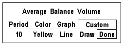
Figure 14
Custom Aspen Formulas:
OBVol(series)=if($1.close>$1.prev,obvol[1]+
$1.volume,if($1.close<$1.prev,obvol[1]-$1.volume,obvol[1]))
ABVol(series)=savg(OBVol($1),10)
These formulas, once entered in the Formula Listing, allow you to use the Average Balance Volume study in color rules and alarms as shown in the following examples.
Color Rule Example:
if(ABVol($1)>ABVol($1)[1] and ABVol($1)[1] >ABVol($1)[2] and ABVol($1)[2]> ABVol($1)[3],clr_green,
if(ABVol($1)<ABVol($1)[1] and ABVol($1)[1] <ABVol($1)[2] and ABVol($1)[2] <ABVol($1)[3],clr_red,clr_yellow))
This three-part color rule will turn a bar green when the Average Balance Volume has increased for three consecutive periods; it will turn a bar red when the Average Balance Volume has declined for three consecutive periods, and it will leave all other bars yellow.
Alarm Example:
chart((ABVol(sp#)>ABVol(sp#)[1] and sp#<sp#[1]) or (ABVol(sp#)<ABVol(sp#)[1] and sp#>sp#[1])[-1],30,1,100,1,3)
This alarm will trigger when the direction of the Average Balance Volume line is diverging from price action. The alarm is based on 30-minute bars of the current S&P contract.
Charting Setup Idea:
When graphed, the Average Balance Volume can sometimes appear as a type of oscillator. It can, like other oscillators, be graphed as a histogram rather than as a line chart. To draw this study as a histogram, see the Charting Setup Idea section at the end of the Acceleration study.
Average Directional Index (ADX) Top of PageWhat it Does:
The Average Directional Index, often referred to as the Average Directional Movement Index or ADX, indicates the strength of a trend by measuring the degree of directional movement up or down. The ADX fluctuates between 0 and 100, with the higher values reflecting stronger trends. The ADX is designed to be used with the Directional Indicator, and is often displayed as an overlay on top of this study. Together, these two studies are often considered a Directional Movement System.
Type of Study |
Keyboard Command |
It works best in... |
| Trend Indicator | .adx | Cash and Futures markets, all time frames |
Table 4
When the ADX line has risen above both the DI+ and DI- lines and then makes its first down turn, a trend reversal is often indicated. When the ADX line goes below the DI+ and DI- lines, it is a sign that trend-following systems should not be used; the market has entered a sideways or choppy phase.
For details on how to overlay the ADX on the Directional Indicator, see Add A Study earlier in the Studies section.
How Aspen Calculates It:
The Average Directional Index study is calculated like this:
100 * DI+ minus DI-
DI+ plus
DI-
The above value is referred to as the DX. A modified moving average of the DX is then taken, and this is referred to as the Average Directional Index or ADX.
For an explanation of how the DI+ and DI- values are calculated, see the Directional Indicator study.
Figure 15 shows the ADX overlaid onto the Directional Indicator. Although the ADX is usually displayed as a solid line, it is shown here as a dotted line to distinguish it from the DI+ and DI- lines.
In mid-March, the DI+ line was significantly above the DI- line signifying a strong uptrend. The ADX crossed above the DI+ line but soon turned down, predicting a reversal. This prediction was soon confirmed by price action as the market broke.
Note also that when the ADX dropped below both lines in mid-April, it corresponded to the sideways movement of the market. The ADX then reversed direction and turned up as a new uptrend began.
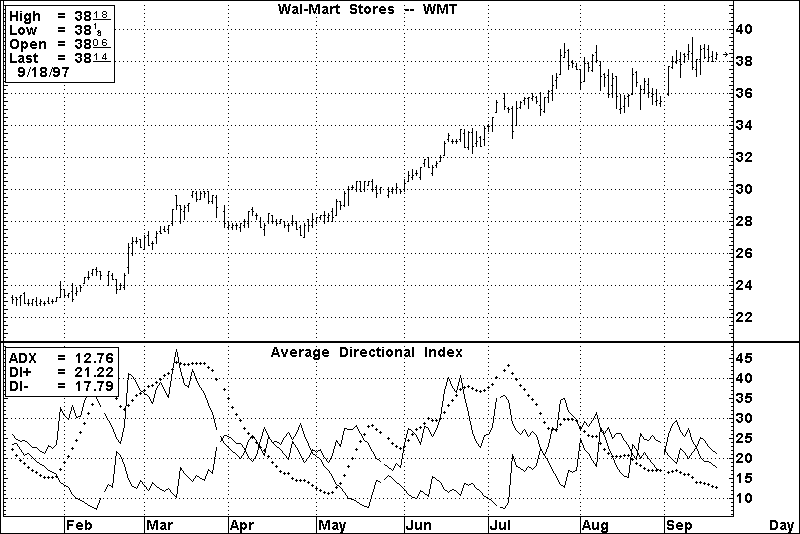
Figure 15
Default Parameters Settings:
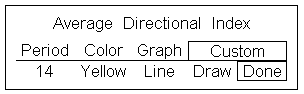
Figure 16
Related Aspen Function: adx( )
Example: adx($1,14)
Key to Examples |
This function allows you to use the Average Directional Index study in color rules and alarms as shown in the following examples.
Color Rule Example:
if(adx($1,14)>dmineg($1,14) and adx($1,14)>dmipos($1,14) and adx($1,14)<adx($1,14)[1] and adx($1,14)[1]>adx($1,14)[2],clr_red,clr_yellow)
This color rule will turn a bar red when the ADX line is above both the DI+ and DI- lines and it has just turned down. All other bars will remain yellow.
Alarm Example:
chart((adx(mu,14)>dmineg(mu,14) and adx(mu,14)>dmipos(mu,14) and adx(mu,14)<adx(mu,14)[1] and adx(mu,14)[1]>adx(mu,14)[2]),1,2,100,1,1)
This alarm will trigger at the end of the day for the same condition as described in the color rule above. The alarm is based on daily values for Micron stock.
Formula Example:
ADX_Ovrly(input)=adx($1,14)
This custom formula benefits those who regularly overlay the ADX study on top of the Directional Indicator study. Once entered in the Formula Listing menu, it can be accessed from the Select Studies menu by selecting Formulas…
Bollinger Bands Top of PageWhat it Does:
This study was developed by John Bollinger based on his theory that the band width of an envelope should be a function of a market’s volatility.
Bollinger Bands are similar to the Moving Average Envelope and Keltner Channel studies. The difference lies in the method used to calculate how far the bands should be drawn above and below the moving average line. Bollinger Bands are based on the number of standard deviations above and below the moving average.
Type of Study |
Keyboard Command |
It works best in...… |
| Trend Follower | .bb | Cash and Futures markets in all time frames, with daily being the most popular. |
Table 5
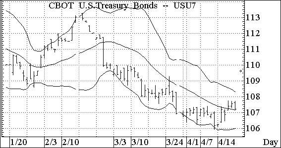
Figure 17
Figure 17 highlights several important aspects of Bollinger Bands. They are as follows:
Bollinger Bands can also be used to spot exhaustion of a trend. Exhaustion can be indicated by a sharp move outside the bands followed immediately by a retracement.
Default Parameters Settings:
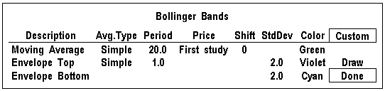
Figure 18
Related Aspen Functions:
bb( ) Example: bb($1,20,2) Top Band
bb($1,20,-2) Bottom Band
Key to Examples |
This function allows you to use Bollinger Bands in color rules and alarms, as in the following examples.
Color Rule Example:
if($1.high>bb($1,20,2,clr_red,if($1.low<bb($1,20,-2),clr_green,clr_yellow))
This three-part color rule will turn a bar red when the high price of that bar penetrates the top Bollinger band, green when a bar penetrates the lower Bollinger band, and all other bars will remain yellow.
A Bollinger Band study does not need to be on the chart to use this color rule. |
Alarm Example:
chart((us#.high>bb(us#,20,2) or us#.low<bb(us#,20,-2))[-1],1,2,100,1,1)
This alarm will trigger when either the top or bottom Bollinger Band is penetrated. The alarm is based on daily bars for the front month of bonds.
Top of PageWhat it Does:
The CCI measures how far away a price is from its average. In any given market, 70 to 80 percent of random price fluctuations should fall within the +100 to -100 range of the CCI. If the CCI yields a value above +100, a long position may be indicated. When the CCI value falls back below +100, closing a long position should be considered. The same is true for short positions. When the CCI falls below -100, it is an indication to go short. It is also an indication to cover your short position when the CCI rises above -100.
Type of Study |
Keyboard Command |
It works best in... |
| Overbought/ Oversold | .cci | Cash and Futures markets that trade in cyclical patterns |
Table 6
How Aspen Calculates It:
The Commodity Channel Index is calculated as follows:
High,Low,Close avg-Current Simple Moving Avg
.015 * Mean Deviation
The CCI study on the chart in Figure 19 shows how it can be used to time a short position. If a short position was initiated in late April 1997 when the CCI dipped below -100 and was reversed when the CCI climbed back above -100 at the end of the month, the entire downtrend during that period could have been captured.
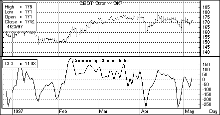
Figure 19
Default Parameters Settings:
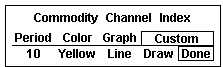
Figure 20
Related Aspen Functions: cci( )
Example: cci($1,7)
Key to Examples |
This function will allow you to use the Commodity Channel Index study in color rules and alarms as shown in the following examples.
Color Rule Example:
if(cci($1,14)>125,clr_green,if(cci($1,14)<-125,clr_red,clr_yellow))
This three-part color rule will turn a bar green when the CCI has a value over 125 and will turn a bar red when the CCI has a value under -125; all other bars will remain yellow.
Alarm Example:
chart((cci(o#,7)>125 or cci(o#,7)<-125)[-1],1,2,100,1,3)
This alarm will trigger when the 7-period CCI is over 125 or under -125. The alarm is based on daily bars of the front month of oats.
Charting Setup Idea:
Oscillators like the CCI are sometimes graphed as histograms rather than as line charts. To draw this study as a histogram, see the Charting Setup Idea section at the end of the Acceleration study.
Top of PageWhat it Does:
Cumulative Volume is a weighted version of the On Balance Volume study. It adds or subtracts a prorated portion of the current volume to the previous Cumulative Volume value. The result is a weighted volume accumulator. On intraday charts, the accumulated tick volume for the period is used.
Type of Study |
Keyboard Command |
It works best in... |
|
| Activity Indicator | .cvl | Active Cash and Futures markets, all time frames | |
Table 7
How Aspen Calculates It:
The Cumulative Volume study is calculated as follows:
((Current Price - Previous Price) * Volume) + the previous Cumulative Volume value
Just like the On Balance Volume, the Cumulative Volume study uses an arbitrary positive integer as a starting point for the calculations. For this reason, the Custom Aspen Formula may not have the same value as the Cumulative Volume that is pre-programmed in Aspen Graphics; the extent of your database may also have an effect on this value. The shape of the graph, however, should look the same. As mentioned in the On Balance Volume section, the shape of the line is the most important aspect of these studies.
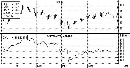
Figure 21
Default Parameters Settings:
Figure 22
Custom Aspen Formula:
CumVol(series)=CumVol[1]+(($1-$1[1]) *$1.volume)
This formula, once entered in the Formula Listing, allows you to use the Cumulative Volume study in color rules and alarms as shown in the following examples.
Color Rule Example:
if(CumVol($1)>CumVol($1)[1] and CumVol($1)[1] >CumVol($1)[2] and
CumVol($1)[2]> CumVol($1)[3],clr_green,if(CumVol($1)
<CumVol($1)[1] and CumVol($1)[1]
<CumVol($1)[2] and CumVol($1)[2]
<CumVol($1)[3],clr_red,clr_yellow))
This three-part color rule will turn a bar green when the Cumulative Volume has increased for three consecutive periods; it will turn a bar red when the Cumulative Volume has declined for three consecutive periods, and it will leave all other bars yellow.
Alarm Example:
chart((if(CumVol(sp#)>CumVol(sp#)[1] and sp#<sp#[1] or CumVol(sp#)<CumVol(sp#)[1] and sp#>sp#[1])[-1],30,1,100,1,3)
This alarm will trigger when the direction of the Cumulative Volume line is diverging from price action. The alarm is based on 30-minute bars of the S&P’s.
Charting Setup Idea:
The Cumulative Volume study can sometimes appear as a type of oscillator. It can, like other oscillators, be graphed as a histogram rather than as a line chart. To draw this study as a histogram, see the Charting Setup Idea section at the end of the Acceleration study.
Top of PageWhat it Does:
The Directional Indicator is used to determine if the market is in trend mode. This makes it one of the few studies that doesn’t simply follow a trend, but identifies the presence, strength and direction of a trend. It is often referred to as the DMI.
Type of Study |
Keyboard Command |
It works best in... |
| Trend Indicator | .dm | Cash and Futures markets, all time frames |
Table 8
How Aspen Calculates It:
Two lines make up the Directional Indicator: the DI+ line and the DI- line. These lines measure the greatest part of the current price range that lays outside of the previous price range. A value is assigned either to the directional movement up (+DM) or to the directional movement down (-DM) for any given period; the other value is set to zero. For example, if the difference between the current and previous high is 8 points and the difference between the current and previous low is 5 points, we say that the directional movement up is eight, and the directional movement down is zero.
The DI+ and DI- lines are plotted together. When the DI+ is above the DI-, a long position is indicated, and when the DI- is above the DI+, a short position is indicated.
+DM = current high - previous high
-DM = current low - previous low
If +DM>-DM, then -DM = 0
If -DM>+DM, then +DM = 0
If the current range equals or lays within the
previous range, both +DM and -DM = 0.
The DI+ Line is:
(modified moving avg of the +DM) * 100
modified moving avg of the Avg True Range
The DI- Line is:
(modified moving avg of the -DM) * 100
modified moving avg of the Avg True Range
Because the directional movement is divided by the instrument’s average true range, the Directional Indicator is "normalized," which means you can use it to compare instruments across markets and in different trading ranges.
On the chart in Figure 23, the Directional Indicator is signaling a long position until the middle of March. The study indicates that this position should be closed when the DI+ line (on top) crosses below the DI- line. A new long position taken on April 9, when the DI+ line once again rose above the DI- line, would have kept you in the market to enjoy the April/May rally which followed.
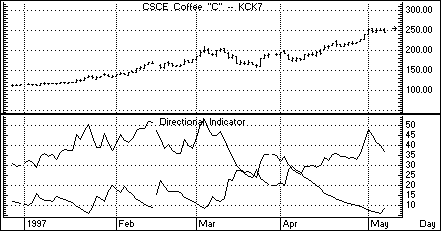
Figure 23
Default Parameters Settings:
Figure 24
Related Aspen Functions:
dmineg( ) DI- line Example: dmineg($1,14)
dmipos( ) DI+ line Example: dmipos($1,14)
Key
to Examples |
These functions allow you to use the DI- and DI+ lines of the Directional Indicator study in color rules and alarms as shown in the following examples.
Color Rule Example:
if(dmipos($1,14)>=dmineg($1,14),clr_green,clr_red)
This color rule will turn all bars green when the DI+ line is above or equal to the DI- line and will color all bars red when the DI+ line is below the DI- line.
Alarm Example:
chart((abs(dmipos(kc#,14)-dmineg(kc#,14))>=15)[-1],1,2,100,1,1)
This alarm will trigger when there is a spread of at least 15 points between the DI+ and the DI- lines. The alarm is based on daily bars for the front month of coffee futures.
Charting Setup Idea:
This study can be used by itself or in conjunction with the Average Directional Index as an indicator of trend strength. To overlay the Average Directional Index on top of this study, see the instructions for "Adding a Study" earlier in the Study chapter.
Directional OscilIator
Top of PageWhat it Does:
The Directional Oscillator combines the DI+ and DI- lines of the Directional Indicator (also known as the Directional Movement Index) into one line that fluctuates above and below zero. The signals generated by the Directional Oscillator and the Directional Indicator are identical. See Directional Indicator in this section for more information on the DI+ and DI- lines.
Type of Study |
Keyboard Command |
It works best in... |
| Trend Indicator | .do | Cash and Futures markets, all time frames |
Table 9
How Aspen Calculates It:
The Directional Oscillator study is calculated as follows:
DI+ minus DI-
For an explanation of how the DI+ and DI- values are calculated, see the Directional Indicator study.
Default Parameters Settings:
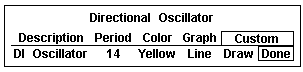
Figure 25
Custom Aspen Formula:
DirOsc(series)=dmipos($1,14)-dmineg($1,14)
This formula will allow you to use the Directional Oscillator study in color rules and alarms.
Color Rule Example:
if(DirOsc($1,14)>=0,clr_green,clr_red)
This color rule will color all bars green when the Directional Oscillator is positive and will color all bars red when the Directional Oscillator is negative.
Alarm Example:
chart(((DirOsc(nscp)-DirOsc(nscp)[5])>=25)[-1],1,2,100,1,1)
This alarm will trigger when the Directional Oscillator has increased by at least 25 points over the last 5 days. The alarm is based on daily bars for Netscape stock.
Charting Setup Idea:
This study can be used in a chart window by itself, or it can be overlaid onto the Directional Indicator study. To view these two studies together, see the instructions for Add a Study in the beginning of this chapter.
Oscillators like the Directional Oscillator are sometimes graphed as histograms rather than as line charts. To draw this study as a histogram, see the Charting Setup Idea section at the end of the Acceleration study section.
Top of PageWhat it Does:
The HiLo Oscillator provides a measurement of directional movement. Periods which gap up or gap down will often register large positive and negative values on the HiLo Oscillator. This study takes the difference of the current period’s high and previous period’s close and divides it by the current period’s true range.
Type of Study |
Keyboard Command |
It works best in... |
| Overbought/ Oversold |
.hlo | Cash, Futures, and Options markets in all time frames and all market conditions. |
Table 10
The true range is defined as the greater of the following three values:
The current high minus the previous close; The current high minus the current low; or The previous close minus the current low.
The HiLo Oscillator is plotted on a scale between -100 and 100, and like the A/D Oscillator, often fluctuates dramatically between these numbers. To make this study easier to read, a moving average can be applied to the HiLo Oscillator and overbought/oversold zones can be applied to this moving average.
How Aspen Calculates It:
The HiLo Oscillator is calculated as follows:
100 * Current High - Previous Close
True Range
Where True Range = true high - true low
Default Parameters Settings:
Figure 26
Custom Aspen Formulas:
HiLoOsc(series)=100*($1.high-$1.prev)/$1.trange
This formula allows you to use the HiLo Oscillator study in color rules and alarms as shown in the following examples.
Color Rule Example:
if(HiLoOsc($1)>90 or HiLoOsc($1)<-50,clr_red,clr_yellow)
This color rule will turn a bar red when the value of the HiLo Oscillator is over 90 or less than -50, and leave all other bars yellow.
Alarm Example:
chart(eavg(HiLoOsc(sm#1),6)>=70 or eavg(HiLoOsc(sm#1),6)<=30),1,2,100,1,3)
This alarm will trigger if, at the end of the day, the 6-period exponential moving average of the HiLo Oscillator is above 70 or below 30. The alarm is based on daily bars of the first month out soybean meal contract.
Charting Setup Idea:
Oscillators like the HiLo Oscillator are sometimes graphed as histograms rather than as line charts. To draw this study as a histogram, see the Charting Setup Idea section at the end of the Acceleration study.
Top of PageWhat it Does:
Historical Volatility is a measure of price fluctuation over time. This study measures the likelihood of certain price levels being reached. If a market has large price swings over time, it is considered to have high historical volatility. In such a market, it is more likely that higher highs and lower lows will be hit than in a market that doesn’t have such dramatic price swings.
Notice that Historical Volatility doesn’t predict the direction of price movement. Instead, it shows how much the price has changed over a range of recent prices, and this information can be used in predicting the likelihood of future price movements. For example, rising volatility in a market that has been moving sideways usually indicates that prices are ready to break out of their current trading range to either the up or down side. It is also the case that decreasing volatility signals a breakout as market makers may soon step in to infuse new activity into a consolidated market.
Type of Study |
Keyboard Command |
It works best in... |
| Activity Indicator | .hvol | Cash, Futures and Options markets, all time frames |
Table 11
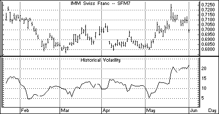
Figure 27
How Aspen Calculates It:
First identify the mean, and then calculate the standard deviation:
Formula:
Historical Volatility:
![]()
Where:
![]() =standard dev, or historical
volatility
=standard dev, or historical
volatility
n = number of occurrences (bars)
m = mean
xi = price changes
And:
Mean:
![]()
Where:
And:
xi can equal percent of price change:
![]()
Or:
xi can equal natural logarithmic price change:
![]()
Default Parameters Settings
: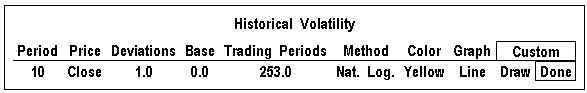
Figure 28
Related Aspen Function: hvol( )
Examples:
hvol($1,10,1,253,0)
hvol($1,10)
Key to Examples |
This function allows you to use the Historical Volatility study in color rules and alarms as shown in the following examples.
Color Rule Example:
if(hvol($1,10)<5,clr_cyan,clr_yellow)
This color rule will change a bar to cyan when the historical volatility drops below five percent and will leave all other bars yellow.
Alarm Example
chart((hvol(sp#,10)>25)[-1],1,2,100,1,1)
This alarm will trigger when the historical volatility for the front month of the S&P’s exceeds 25. The alarm is based on daily bars.
Formula Example:
hsvol(series)=hvol($1,6)/hvol($1,100)
In their book, Street Smarts, Linda Raschke and Larry Connors describe an indicator in which the six-day historical volatility is divided by the 100-day historical volatility. The formula above, once entered in the Formula Listing, will allow you to chart this indicator. From the Select Study menu, single left click on Formulas…and then select hsvol from the Select Formula Study menu.
Top of PageWhat it Does:
This study was developed by Chester W. Keltner and is similar to the Moving Average Envelope and Bollinger Band studies. The difference lies in the method used to calculate how far the bands should be drawn above and below the moving average line. Keltner Channels are drawn above and below the moving average at a distance which is the weighted 10-period moving average of the true range multiplied by a constant.
Type of Study |
Keyboard Command |
It works best in...… |
| Trend Follower | .keltner | Cash and Futures markets that are trending. |
Table 12
Default Parameters Settings:
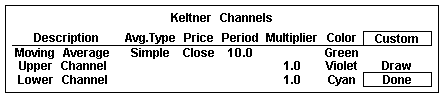
Figure 29
Related Aspen Functions: keltner( )
Example:
keltner($1,10,1) Upper Channel (default parameters)
keltner($1,10,-1) Lower Channel (default parameters)
Key
to Examples |
Color Rule Example:
if($1.high>keltner($1,10,1),clr_red,if($1.low<keltner($1,10,-1), clr_green,clr_-yellow))
This three-part color rule will turn a bar red when the high price of that bar penetrates the top Keltner Channel, green when it penetrates the lower Keltner Channel, and will leave all other bars yellow.
Alarm Example:
chart((msft.high>keltner(msft,10,1) or msft.low<keltner(msft,10,-1))[-1],1,2,100,1,1)
This alarm will trigger when either the top or bottom Keltner Channel for Microsoft is penetrated. The alarm is based on daily bars.
Moving Average Convergence Divergence (MACD)
Top of PageWhat it Does:
The MACD study measures overbought or oversold conditions. The MACD differs from the Moving Average Oscillator in that it uses two moving averages of the same average type (exponential) but different number of periods.
Type of Study |
Keyboard Command |
It works best in...… |
| Overbought/ Oversold |
.macd | Cash and Futures markets with wide trading ranges, and at the end of strong trends. |
Table 14
How Aspen Calculates It:
Moving Average Convergence Divergence (MACD) is as follows:
MACD Line = short term Exponential Moving Average with smoothing factor minus long term Exponential Moving Average with smoothing factor.
Signal Line = Exponential Moving Average of the MACD line.
Overbought and oversold conditions are indicated where the MACD line crosses above or below its moving average. These crossovers must occur above or below certain levels for the signal to be valid.
Bull markets are often indicated when the MACD line is above the signal line and rising; it is just the opposite for bear markets. These are only generalizations; the strongest signals are produced in volatile or trending markets.
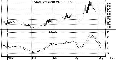
Figure 30
Default Parameters Settings:
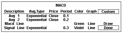
Figure 31
Note that the periods for the MACD are expressed differently than in other studies. This is because the number of periods are related to the smoothing factor 2/(n+1), where n is the number of periods in the moving average. When you enter a value in the Period field, you can enter either a whole number for the number of periods or a decimal value for the smoothing factor. It’s automatically converted for you, as shown in Table 15.
If you enter this value in Periods field: |
Aspen calculates the number of periods (n) like this: |
.1 |
1 = 2/(n+1) 1 = 20/(n+1) 1/20 = 1/(n+1) 20 = n+1 19 = n so Periods = 19 |
.2 |
2 = 2/(n+1) 2 = 20/(n+1) 1/10 = 1/(n+1) 10 = n+1 9 = n so Periods = 9 |
.3 |
3 = 2/(n+1) 3 = 20/(n+1) 3/20 = 1/(n+1) 20/3 = n+1 17/3 = n so Periods = 5.67 |
Table 15
Custom Aspen Formulas:
MACD_(series)=eavg($1,.2)-eavg($1,.1)
Signal_Line(input)=eavg(macd_($1),.3)
These formulas, once entered in the Formula Listing, allow you to use MACD study in color rules and alarms as shown in the following examples.
Color Rule Example:
if(MACD_($1)>MACD_($1)[1] and MACD_($1)>Signal_Line($1),clr_green, if(MACD_($1)<MACD_($1)[1] and MACD_($1)<Signal_Line($1),clr_red,clr_yellow))
This three-part color rule will turn the bars green where the MACD line is rising and it is above the Signal line. Where the MACD line is falling and it is below the Signal line, the bars will be red. All other bars will be yellow.
Alarm Example:
chart((MACD_(w#)>=Signal_Line(w#))[-1],30,1,100,1,3)
(make sure to set Trigger When State: to Changes)
This alarm will trigger each time the MACD line crosses the Signal line for the front month of wheat. The alarm is based on 30-minute bars.
Top of PageWhat it Does:
The MACD Oscillator converts the two lines of the MACD into a single line that fluctuates above and below zero. The MACD Oscillator is calculated by subtracting the Signal Line value from the MACD Line value. When the MACD Line crosses the Signal Line, the MACD Oscillator displays a value of zero, and a buy or sell signal is generated. The signals provided by the MACD and the MACD Oscillator are identical.
Type of Study |
Keyboard Command |
It works best in...… |
| Overbought/ Oversold |
.macdo | Cash and Futures markets with wide trading ranges and at the end of strong trends. |
Table 16
How Aspen Calculates It:
The MACD Osc is: MACD Line minus Signal Line
MACD Line = short term Exponential Moving Average with smoothing factor minus long term Exponential Moving Average with smoothing factor.
Signal Line = Exponential Moving Average of the MACD Line
The MACD Oscillator study may indicate oversold conditions when it crosses above the "zero line." When the oscillator moves back below zero again, overbought conditions may be indicated.
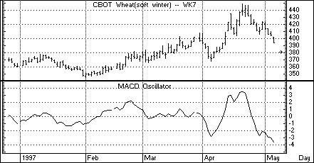
Figure 32
Default Parameters Settings:
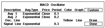
Figure 33
Note that the periods for the MACD Oscillator are expressed just like the MACD study, which are different from the other studies in Aspen Graphics. For an explanation of how these periods are calculated, see the Default Parameters Settings for the MACD study in the previous section.
Custom Aspen Formulas:
MACD_(series)=eavg($1,.2)-eavg($1,.1)
Signal_Line(input)=eavg(macd_($1),.3)
MACD_Osc(series)= MACD_($1)-Signal_Line($1)
These formulas, once entered in the Formula Listing, allow you to use the MACD Oscillator study in color rules and alarms, as shown in the following examples.
Color Rule Example:
if((MACD_Osc($1)>=0 and MACD_Osc($1)[1]<0),clr_green, if((MACD_Osc($1)<=0 and MACD_Osc($1)[1]>0),clr_red,clr_yellow))
This three-part color rule will turn the bar green where the MACD Oscillator has changed to a positive value; it will turn the bar red where the MACD Oscillator has changed to a negative value, and all other bars will remain yellow.
Alarm Example:
chart((MACD_Osc(c#)>=0)[-1],30,1,100,1,3)
(make sure to set Trigger When State: to Changes)
This alarm will trigger each time the MACD Oscillator line crosses the "zero" line for the front month of corn. The alarm is based on 30-minute bars.
Charting Setup Idea:
Oscillators are sometimes graphed as histograms rather than as line charts. To draw this study as a histogram, see the Charting Setup Idea section at the end of the Acceleration study.
Top of PageWhat it Does:
Momentum is the difference between the current price and a previous price. Momentum indicates the rate of change in prices and helps determine when a trend is "running out of steam." If prices are going up but momentum is falling, prices are expected to rise less quickly, signaling that the current trend may be coming to an end.
The Momentum study can generate buy signals. When momentum has been negative and then becomes positive, a buy may be indicated if this is also the direction of the current trend.
Divergence between momentum and price is another important use of this study. A down trend may be coming to an end if prices make new lows, but momentum makes higher lows; the same is true for an up-trend when price and momentum diverge.
Type of Study |
Keyboard Command |
It works best in...… |
|
| Overbought/ Oversold |
.mom | Cash and Futures markets, all time frames | |
Table 13
How Aspen Calculates It
Momentum is: Current Price - Price n periods ago
The user determines which price (i.e. how many bars back) should be subtracted from the current price.
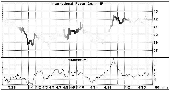
Figure 34
The trendlines drawn on the chart in Figure 34 show divergence between price and momentum; price was going down while momentum was going up, and the downtrend was soon reversed.
Default Parameters Settings:
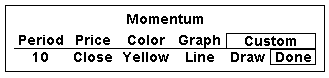
Figure 35
Related Aspen Functions: mom( )
mom( ) Example: mom($1,21)
The mom( ) function allows you to use Momentum in color rules and alarms as shown in the following examples.
Key
to Examples |
Color Rule Example
:if(mom($1,21)>0 and mom($1,21)[1]<=0,clr_blue,clr_yellow)
This color rule will turn a bar blue when the 21-period momentum becomes positive.
Alarm Example:
chart((ip.high>ip.high[1] and ip.high[1]>ip.high[2] and mom(ip,10)<mom(ip,10)[1] and mom(ip,10)[1]<mom(ip,10)[2])[-1],15,1,100,1,1)
This alarm is monitoring divergence between price and momentum. The alarm will trigger when the high price of International Paper has increased over the last two periods while the 10-period momentum was falling during that same period. The alarm is based on 15-minute bars.
Formula Example:
LBR_RSI=chart(rsi(mom($1,1),3)[-1],1,2,100,1,3)
In their book Street Smarts, Linda Raschke and Laurence Connors talk about a trading technique they call "Momentum Pinball." This technique uses a 3-period RSI study on a 1-period Momentum study.
This combination can be easily charted in Aspen using the "Add a Study" option on the Select Study menu and the "First Study" price parameter.
The LBR_RSI can also be quoted on a quote page using the preceding formula.
Charting Setup Idea:
Oscillators such as Momentum are sometimes graphed as histograms rather than as line charts. To draw this study to a histogram, see the Charting Setup Idea section at the end of the Acceleration study.
Top of PageWhat it Does:
Moving averages are smoothing techniques. They are the average price of an instrument over a certain number of periods. Faster moving averages are based on fewer periods, and slower moving averages are indicative of long-term trends. The strength of a trend is indicated by the steepness of the moving average’s slope.
Moving averages are always lagging indicators because they incorporate historical data. For this reason, they are used more to confirm that a change in trend has already taken place than as a way of predicting when a change will occur.
Type of Study |
Keyboard Command |
It works best in...… |
||
| Trend Follower | .mav | Cash and Futures markets that are trending. | ||
Table 18
Aspen Graphics has five different types of moving averages. These five moving averages are listed and explained in Table 19.
Key
to Table 19 |
Description |
How Aspen Calculates It |
Simple Moving Average |
|
| Average (mean) of data over n periods | P+P1+…+P(n-1) n |
Modified Moving Average |
|
| Subtracts last moving average value instead of oldest data | MAPrev+1/n(P-MAPrev) |
Exponential Moving Average |
|
| Assigns more weight to newer data using a geometric formula | P+a*P1+a2*P2+…+(an-1)*Pn-1 1+a+a2+…+a(n-1) |
Weighted Moving Average |
|
| Assigns more weight to newer data using an arithmetic formula | n*P+(n-1)*P1+(n-2)*P2+.+P(n-1) 1+2+3+…+n |
Hamming Moving Average |
|
| Weights recent data much more heavily than older data using a sine wave curve function | Proprietary; developed by Aspen Research Group |
Table 19
Default Parameters Settings:
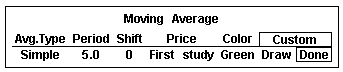
Figure 36
Related Aspen Functions:
savg( )
Simple Moving Avg. savg($1,21)mavg( ) Modified Moving Avg. mavg($1,14,1)
eavg( ) Exponential Moving Avg eavg($1,10)
wavg( ) Weighted Moving Avg. wavg($1,52)
havg( ) Hamming Moving Avg. havg($1,5,1)
Key
to Examples |
Color Rule Example:
if(savg($1,5)<savg($1,5)[1] and savg($1,5)[1]>savg($1,5)[2],clr_green,clr_yellow)
This color rule will turn the bar green when a 5-period simple moving average reverses direction on a high (i.e. the current moving average value is less than the one before, and that value was greater than the moving average value two bars back).
Alarm Example:
chart((sp#.low>wavg(sp#,5))[-1],1,2,100,1,3)
This alarm will trigger when the low is higher than the 5-day weighted moving average.
Formula Example:
doubleEAVG(input)=eavg(eavg($1,14),14)
This formula can be charted as an overlay and produces a super-smooth double exponential moving average (a moving average of a moving average).
Top of PageWhat it Does:
The Moving Average Envelope study draws bands around a moving average to form a channel. The purpose of the bands is to show which prices are falling outside of the expected range.
The Moving Average Envelope study is very similar to the Bollinger Band and Keltner Channel studies; the difference lies in the method used to calculate how far the bands should be drawn above and below the moving average line. The Moving Average Envelope bands are drawn above and below the moving average at a distance which is a percentage of the moving average value. For example, if the value of the moving average at a particular bar is 100 and the Percent field is set to 0.5, the top and bottom bands will be drawn at 100.5 and 99.5.
Type of Study |
Keyboard Command |
It works best in...… |
| Trend Follower | .env | Cash and Futures markets that are trending |
Table 20
Figure 37 shows a Moving Average Envelope around a 10-day simple moving average with bands set at 2% above and below the average.
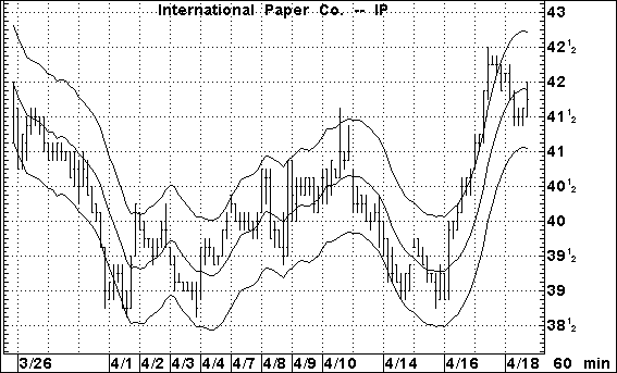
Figure 37
Default Parameters Settings:
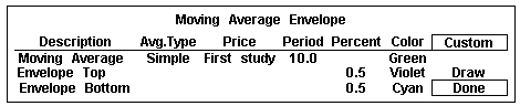
Figure 38
Custom Aspen Formulas:
EnvAverage(input,per=10)=savg($1,per)
EnvTop(input,per=10,prcnt=0.005)=savg($1,per)+prcnt*savg($1,per)
EnvBottom (input,per=10,prcnt=0.005)=savg($1,per)-prcnt*savg($1,per)
These formulas, once entered in the Formula Listing, allow you to use the Moving Average Envelope study in color rules and alarms, as shown in the following examples.
Color Rule Example:
if($1.high<EnvBottom($1) or $1.low>EnvTop($1),clr_red,clr_yellow)
This color rule will turn a bar red when the entire price range for that bar lies outside of the Moving Average Envelope.
Alarm Example:
chart((sp#.high<EnvBottom(sp#) or sp#.low>EnvTop(sp#))[-1],10,1,100,1,3)
This alarm will trigger when the entire price range lies outside of the Moving Average Envelope. The alarm is based on a 10-minute bar chart of the current S&P contract.
Top of PageWhat it Does
:The Moving Average Momentum study measures the rate of change of a moving average. It is very similar to the Acceleration study except that instead of comparing momentum values, this study compares moving average values.
Type of Study |
Keyboard Command |
It works best in...… |
| Overbought/ Oversold | .mavmom | Cash and Futures markets, all time frames. |
Table 21
How Aspen Calculates It:
Moving Average Momentum is:
Current Moving Avg. - Moving Avg n periods back
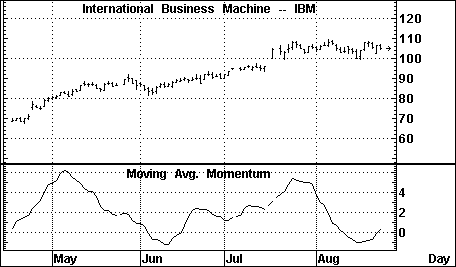
Figure 39
Default Parameters Settings:
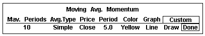
Figure 40
The user determines how many periods should be used in the moving average from the Mav. Periods field of the study’s parameter menu. The number of periods back to be compared against the current moving average value is determined in the Period field of the study’s parameter menu.
Custom Aspen Formulas:
MovAvgMom(series,per=5)=savg($1,10)-savg($1,10)[per]
This formula, once entered in the Formula Listing, allows you to use Moving Average Momentum in color rules and alarms as shown in the following examples.
Color Rule Example:
if(MovAvgMom($1)>1,clr_green,if(MovAvgMom($1)<-1,clr_red,clr_yellow))
This three-part color rule will turn a bar green when the Moving Average Momentum is greater than 1, red when the value is less than -1, and leave all other bars yellow. The color rule is based on a 10-period moving average.
Alarm Example:
chart(MovAvgMom(us#)<-1.5[-1],1,2,100,1,3)
The alarm will trigger when the Moving Average Momentum for the front month of bonds is less than -1.5. The alarm is based on daily bars.
Charting Setup Idea:
The Moving Average Momentum study is an oscillator. By default, the study is drawn as a line but can be graphed as a histogram or a variety of other methods. See the Charting Setup Idea at the end of the Acceleration section.
Top of PageWhat it Does
:This study subtracts one moving average from another. The MACD study, which uses two moving averages of the same average type (exponential) but a different number of periods, is different from the Moving Average Oscillator. This study uses (as default) two different average types (simple and modified) with the same number of periods.
The emphasis of this study lies more in the difference between the two average types than in comparing long and short term trends. Comparing the trends is the job of the MACD.
Type of Study |
Keyboard Command |
It works best in...… |
| Overbought/ Oversold | .mao | Cash and Futures markets that are trending. |
Table 22
How Aspen Calculates It:
The Moving Average Oscillator is:
Moving Avg#1-Moving Avg#2
The user determines the type of moving averages to be used and the number of periods in each moving average.
Default Parameters Settings:
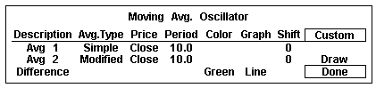
Figure 41
Custom Aspen Formula:
MovAvgOsc(series)=savg($1,10)-mavg($1,10)
This formula, once entered in the Formula Listing, allows you to use Moving Average Momentum in color rules and alarms as shown in the following examples.
Color Rule Example:
if(MovAvgOsc($1)>0 and MovAvgOsc($1)>MovAvgOsc($1)[1], clr_red,clr_yellow)
This color rule will turn a bar red when the Moving Average Oscillator is positive and rising and will leave all other bars yellow.
Alarm Example:
chart((MovAvgOsc(s#)>MovAvgOsc(s#)[1] and MovAvgOsc(s#)[1]> MovAvgOsc(s#)[2] and MovAvgOsc(s#)[2]>MovAvgOsc(s#)[3])[-1], 1,2,100,1,3)
The alarm will trigger when the Moving Average Oscillator for the front month of soybeans has risen for the last three daily bars.
Charting Setup Idea:
The Moving Average Oscillator study is, by default, drawn as a line but can be graphed as a histogram or a variety of other methods; see the Charting Setup Idea at the end of the Acceleration section.
Top of PageWhat it Does:
On Balance Volume is a volume accumulator. All of the volume in an up-period (a period which closes higher than the previous period) is added to the previous On Balance Volume, while all of the volume in a down-period (a period which closes lower than the previous period) is subtracted from the previous On Balance Volume.
Type of Study |
Keyboard Command |
It works best in... |
|
| Activity Indicator | .obv | Cash and Futures markets which are active, all time frames | |
Table 23
The important aspect of this study is the direction and not the exact volume level of the On Balance Volume line. Divergence between price and the On Balance Volume can be a signal of trend reversal. This study can also lend some clues as to supply and demand as measured by the volume in up-periods and the volume in down-periods.
How Aspen Calculates It:
The On Balance Volume study is calculated as follows:
If the current close is greater than the previous close, all the volume for the period is added to the previous On Balance Volume. If the current close is less than the previous close, all the volume for the period is subtracted from the previous On Balance Volume.
The On Balance Volume uses an arbitrary positive integer as a starting point for the calculations. For this reason, the Custom Aspen Formula (below) may not have the same value as the On Balance Volume that is preprogrammed in Aspen Graphics. The extent of your database may also have an effect on this value. The shapes of the two graphs, however, should look the same.
Default Parameters Settings:
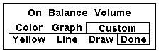
Figure 42
Custom Aspen Formula:
OBVol(series)=if($1.close>$1.prev,obvol[1]+$1.volume,if($1.close<$1.prev,obvol[1]-$1.volume,obvol[1]))
This formula, once entered in the Formula Listing, allows you to use the On Balance Volume study in color rules and alarms, as shown in the following examples.
Color Rule Example:
if(OBVol($1)>OBVol($1)[1] and OBVol($1)[1]>OBVol($1)[2] and OBVol($1)[2]>OBVol($1)[3],clr_green,if(OBVol($1)<OBVol($1)[1] and OBVol($1)[1]<OBVol($1)[2] and OBVol($1)[2]<OBVol($1)[3], clr_red,clr_yellow))
This three-part color rule will turn a bar green when the On Balance Volume has increased for three consecutive periods, turn a bar red when the On Balance Volume has declined for three consecutive periods, and leave all other bars yellow.
Alarm Example:
chart((OBVol(sp#)>OBVol(sp#)[1] and sp#<sp#[1]) or (OBVol(sp#)<OBVol(sp#)[1] and sp#>sp#[1])[-1],15,1,100,1,3)
This alarm will trigger when the direction of the On Balance Volume line is diverging from price action. The alarm is based on 15-minute bars of the front month of the current S&P contract.
Charting Setup Idea:
When graphed, the On Balance Volume can sometimes appear as a type of oscillator. It can, like other oscillators, be graphed as a histogram rather than as a line chart.
To draw this study as a histogram, see the Charting Setup Idea at the end of the Acceleration study section.
Top of PageWhat it Does:
Open Interest is the number of outstanding future contracts at the end of a trading day. This study is not available on stocks, nor is it available in intraday time frames.
Type of Study |
Keyboard Command |
It works best in... |
|
| Activity Indicator | .opint | Futures and Options markets, daily and longer time frames | |
Table 24
When a new contract is written, open interest is increased by a value of one. If an existing contract is traded, open interest remains unchanged, but if a contract is liquidated, open interest is decreased by a value of one.
How Aspen Calculates It:
Calculations don’t take place within the Aspen program for this study. The values for Open Interest are sent by the datafeed just like the price data.
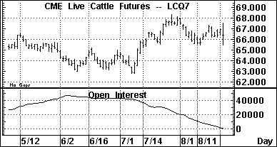
Figure 43
Default Parameters Settings:
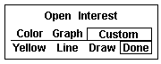
Figure 44
Custom Aspen Formulas:
You can make reference to Open Interest values by using the $1.oi quote code in formulas, color rules and alarms, as shown in the following examples.
Color Rule Example:
if($1.oi>100000,clr_cyan,clr_yellow)
This color rule will turn a bar cyan when open interest exceeds 100,000.
Alarm Example:
spm7.oi>=200000
This alarm will trigger when the open interest of the June ’97 S&P’s reaches or exceeds 200,000.
Parabolic Top of PageWhat It Does:
The Parabolic study sets a stop price for each bar based on the direction of the trend. When the price penetrates the "trail" of Parabolic stops, it is an indication that the position should be reversed. This is called the Stop and Reverse point (SAR).
This study works well in trending markets but can give many false signals that might stop you out of a trade too early when the market is flat. For this reason, the Parabolic study is often used in conjunction with trend identifying indicators like the Directional Indicator or Directional Oscillator.
Type of Study |
Keyboard Command |
It works best in...… |
Trend Follower |
.parab | Cash and Futures markets that are trending. |
Table 25
How Aspen Calculates It:
The initial SAR point represents the last significant high or low. If the market is trending up, stops are placed below the price activity. Stops are placed above the bars during down trends.
At first, these stops are set "loosely" so that you will not be stopped out by the minor volatility of a change in trend. As the trend continues, the stops are "tightened up" in the direction of the trend using an acceleration factor. This factor begins at .02 and increases by .02 to a maximum acceleration factor of .2. This acceleration formula is hard coded into the Aspen Graphics software and cannot be changed by the user.
Once the price penetrates a stop, a new series of Parabolic trailing stops begins on the other side of the price activity and continues until it is penetrated by price.
In Figure 45, a short position is indicated in January of 1997. The dots sloping down above the bars are the trailing stops. On February 10, the stop is penetrated by price, an indication that the position should be reversed. A new series of SAR points begins building below the bars.
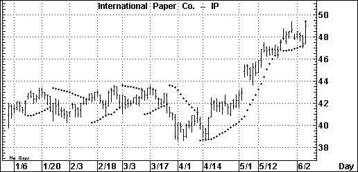
Figure 45
Default Parameters Settings:
Figure 46
Custom Aspen Formula:
The Parabolic is a unique study in Aspen Graphics in that there are no parameters other than color which can be changed by the user.
Because Aspen Graphics has no Parabolic function, and a custom Parabolic study cannot be written as a formula in the Formula Listing menu, no color rules or alarms can be set on Parabolics.
Relative Strength Index (RSI) Top of PageWhat it Does:
Developed by J. Welles Wilder, the RSI is used to determine the strength of a trend and to predict market reversals. This index is an overbought/oversold indicator plotted on a vertical scale from 0 to 100.
Type of Study |
Keyboard Command |
It works best in... |
| Overbought/ Oversold |
.rsi | Cash and Futures markets that are trending; in all time frames. |
Table 26
Values under 30 were considered by Wilder to represent oversold conditions, and RSI values over 70 were considered overbought conditions. Today, RSI values of 80 and 20 are more commonly used.
How Aspen Calculates It:
The Relative Strength Index is calculated as follows:
![]()
where RS is:
modified moving average of x day’s up closes
modified moving average of x day’s down closes
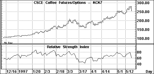
Figure 47
The RSI study in Figure 47 reveals several important aspects of the market activity on the May ‘97 Coffee futures:
The periods of strongest trend are reflected in the steepness of the RSI’s slope. While the highest RSI value on May 1, 1997 didn’t signal an immediate reversal, the market began to consolidate which was an indication that the current uptrend had lost momentum. The market correction on April 21 was preceded by a downturn in the RSI, an indication that the trend was temporarily exhausted.
Default Parameters Settings:
Figure 48
Wilder’s original RSI employed a number of periods equal to half of the normal cycle. For example, if an instrument was presumed to have a 28-day cycle, 14 periods were used in the RSI calculation.
Related Aspen Functions: rsi( )
Example: rsi(sp#,14)
Key to Examples |
This function will allow you to use the Relative Strength Index study in color rules and alarms as shown in the following examples.
Color Rule Example:
if(rsi($1,14)>75,clr_cyan,if(rsi($1,14)<25,clr_red,clr_yellow))
This three-part color rule will turn a bar cyan when the RSI has a value over 75 and will turn a bar red when the RSI has a value under 25; all other bars will remain yellow.
Alarm Example:
chart((rsi(sp#,14)>70 or rsi(sp#,14)<30)[-1],40,0,100,1,1)
This alarm will trigger when the 14-period RSI has a value over 70 or under 30. The alarm is based on a 40-EqTick chart of the current S&P contract.
Formula Example:
The rsi( ) function is used in a custom formula by Linda Raschke and Laurence Connors in their book Street Smarts. Their trading technique called "Momentum Pinball" uses a 3-period RSI study on a 1-period Momentum study. For details on this custom formula, see "Formula Example" at the end of the Momentum section.
Top of PageWhat it Does:
Two lines make up this study: %K and %D. These lines oscillate between 0 and 100. The Fast Stochastic gives a variety of a signals:
Overbought: when the %K is above 80* and crosses below the %D line
Oversold: when the %K is below 20* and crosses above the %D line
*These
values are left to the discretion of the user. Overbought |
| Type of Study | Keyboard Command | It works best in...… |
| Overbought/ Oversold | .fstoch | Cash and Futures markets |
Table 27
According to its developer George Lane, a divergence between the %D line and price produces the most important stochastic signal. Divergence occurs when price is making a series of lower lows while the %D line is making a series of higher lows. This signals an oversold market. A divergence when the %D line is below 15 is commonly thought of as a signal to buy. Overbought conditions are indicated when prices are reaching higher highs while the %D is making lower highs. A divergence when the %D line is above 85 is commonly thought of as a signal to sell.
How Aspen Calculates It:
The Fast Stochastic study is calculated as follows:
Fast %K line is:
100 * (current close - lowest low in n periods)
(highest high in n periods - lowest low in n
periods)
Fast %D line is:
3 period modified moving average of the Fast %K
The chart in Figure 49 shows a buy signal on 2/12/97 where the Fast %K line crosses above the Fast %D line. Later that month and into early March, prices continued to make higher highs while the Fast %D line remains flat. This divergence signaled that a reversal was on its way, a reversal which came when prices broke in mid-March.
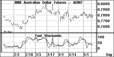
Figure 49
Default Parameters Settings:
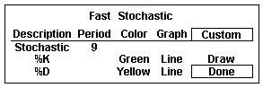
Figure 50
Related Aspen Functions:
fstoch( ) (for the Fast %K line) fstoch($1,14)
sstoch( ) (for the Fast %D line) sstoch($1,14,3)
Key to Examples |
These functions allow you to use the lines of the Fast Stochastic study in color rules and alarms, as shown in the following examples.
Color Rule Example:
if(fstoch($1,14)>sstoch($1,14,3) and fstoch($1,14)[1]<sstoch($1,14,3)[1]and fstoch($1,14)<30,clr_green,if(fstoch($1,14)<sstoch($1,14,3) and fstoch($1,14)[1]>sstoch($1,14,3)[1] and fstoch($1,14)>70, clr_red,clr_yellow))
This three-part color rule will turn a bar green when the Fast %K line has a value under 30 and has crossed above the Fast %D line; it will turn a bar red when the Fast %K line has a value over 70 and has crossed below the Fast %D line, and it will leave all other bars yellow.
Alarm Example:
chart((fstoch(sp#,14)>=sstoch(sp#,14,3))[-1],60,1,100,1,1)
(make sure to set Trigger When State: to Changes)
This alarm will trigger each time the Fast %K and Fast %D lines cross. The alarm is based on hourly bars for the front month of the S&P contract.
Top of PageWhat it Does:
The Modified Stochastic is identical to the Slow Stochastic study, but it allows the user more flexibility. The Fast and Slow Stochastic studies use a 3-period modified moving average to calculate the %D lines. In the Modified Stochastic, the number of periods and the moving average type, as well as the price used to calculate the Fast %K, can be changed by the user.
Type of Study |
Keyboard Command |
It works best in... |
| Overbought/ Oversold | .mstoch | Cash and Futures markets |
Table 28
The way in which the signals are generated, and the values used to calculate overbought and oversold conditions, are the same as for the Slow Stochastic study.
Default Parameters Settings:
Figure 51
Related Aspen Functions and Formulas:
sstoch( ) (for the Slow %K line) sstoch($1,14,3)
ssstoch( ) (for the Slow %D line) ssstoch($1,14,3,3)
These functions allow you to change the number of periods used for the lines of the Modified Stochastic study. Note, however, that they do not allow you to change the Average Type; a modified moving average is used by default. For a different Average Type, use one of the moving average functions in a custom formula as shown in the following examples:
SlowK(input)=eavg(fstoch($1,14),3)
SlowD(input)=savg(wavg(fstoch,$1,14),3),3)
Entering these formulas and using the preceding functions allow you to use the Modified Stochastic study in color rules and alarms as shown in the following examples.
Color Rule Example:
if($1.high>$1.high[1] and $1.high[1]>$1.high[2] and $1.high[2]>$1.high[3] and SlowD($1)<SlowD($1)[1] and SlowD($1)[1]<SlowD($1)[2] and SlowD($1)[2]<SlowD($1)[3],clr_blue,clr_white)
This color rule illustrates a way of signaling divergence. When price has made three consecutive highs but the Slow %D line has been decreasing over the same periods, this color rule will turn the bars blue to denote this divergence; otherwise the bars will remain white.
Alarm Example:
chart((sstoch(pbg8,9,3)>=SlowD(pbg8))[-1],1,2,100,1,1)
(make sure to set Trigger When State: to Changes)
This alarm will trigger each time the Slow %K and Slow %D lines cross. The alarm is based on daily bars for February ’98 pork bellies.
Top of PageWhat it Does:
The Slow Stochastic is a smoothed variation of the Fast Stochastic. There are fewer crossovers, and therefore fewer signals than with the Fast Stochastic.
Type of Study |
Keyboard Command |
It works best in... |
|
| Overbought/ Oversold | .sstoch | Cash and Futures markets. | |
Table 29
Just like the Fast Stochastic, two lines make up this study. In the Slow Stochastic study these lines are referred to as the Slow %K and Slow %D. The way in which the signals are generated, and the values used to calculate overbought and oversold conditions, are the same as for the Fast Stochastic study.
The Slow %K line in the Slow Stochastic is exactly the same as the Fast %D line from the Fast Stochastic. This line is then smoothed with a 3-period modified moving average to create the Slow %D line.
How Aspen Calculates It:
Slow %K line is:
3 period modified moving average of the Fast%K (same as Fast%D line)
Slow %D line is:
3 period modified moving average of the Slow %K line
The chart in Figure 52 shows a strong buy signal on 2/12/97 where the Slow %K line crosses above the Slow %D line at a value under 15.
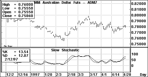
Figure 52
Default Parameters Settings:
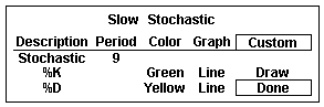
Figure 53
Related Aspen Functions:
sstoch( ) (for the Slow %K line) sstoch($1,14,3)
ssstoch( ) (for the Slow %D line) ssstoch($1,14,3,3)
Key to Examples |
These functions allow you to use the lines of the Slow Stochastic study in color rules and alarms, as shown in the following examples.
Color Rule Example:
if(sstoch($1,14,3)>ssstoch($1,14,3,3) and sstoch($1,14,3)[1]<ssstoch($1,14,3,3)[1] and sstoch($1,14,3)<30,clr_green, if(sstoch($1,14,3)<ssstoch($1,14,3,3) and sstoch($1,14,3)[1]>ssstoch($1,14,3,3)[1] and sstoch($1,14,3)>70, clr_red,clr_yellow))
This three-part color rule will turn a bar green when the Slow %K line has a value under 30 and has crossed above the Slow %D line; it will turn a bar red when the Slow %K line has a value over 70 and has crossed below the Slow %D line, and it will leave all other bars yellow.
Alarm Example:
chart((sstoch(sp#,14,3)>=ssstoch(sp#,14,3,3))[-1],60,1,100,1,1)
(make sure to set Trigger When State: to Change). This alarm will trigger each time the Slow %K and Slow %D lines cross. The alarm is based on hourly bars for the front month of the S&P contract.
Variable Accumulation Distribution
Top of PageWhat it Does:
Variable Accumulation Distribution modifies the concept of the On Balance Volume study by comparing the opening and closing prices to the range of prices for a given period. Accumulation, or acquisition of long positions in anticipation of a bull market, is reflected in positive values of the Variable Accumulation Distribution. Negative values reflect distribution or selling in the anticipation of a market decline.
Type of Study |
Keyboard Command |
It works best in... |
| Activity Indicator | .vad | Cash, Futures and Options markets in all time frames and all market conditions. |
Table 30
How Aspen Calculates It:
Variable Accumulation Distribution is:
(Close-Open) * Volume
(High-Low)
Once this is calculated, a moving average of this value is taken. It is this moving average that is charted as the Variable Accumulation Distribution study.
Default Parameters Settings:
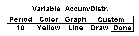
Figure 54
Custom Aspen Formula:
VADist(series)=savg($1.volume*(($1.close-$1.open)/($1.high-$1.low)),10)
Once this formula is entered in the Formula Listing, the study may be used in color rules and alarms, as shown in the following examples.
Color Rule Example:
if(VADist($1)>=0,clr_green,clr_red)
This color rule will turn a bar green when the Variable Accumulation Distribution study has a positive value and will turn a bar red when the value is negative.
Alarm Example:
chart((VADist(kc#)>2000)[-1],1,2,100,1,3)
This alarm will trigger when the Variable Accumulation Distribution study has a value exceeding 2,000 based on daily bars of the front month of coffee.
Charting Setup Idea:
Oscillators like the Variable Accumulation Distribution study are sometimes graphed as histograms rather than as line charts. To draw this study as a histogram, see the Charting Setup Idea section at the end of the Acceleration study section.
Top of PageWhat it Does:
Volume measures the activity on an instrument during any given period. The Volume study measures different things depending on the instrument type and time frame that you are examining.
Type of Study |
Keyboard Command |
It works best in... |
| Activity Indicator | .vol | Cash and Futures markets which are active, all time frames |
Table 31
The Volume study can offer a variety of signals. When markets are trending upward in price, the strength of the trend can be confirmed by rising volume. If the volume is stagnating or decreasing while prices are rising, it can be a signal that the market is weakening, and a top may soon be reached. Because there is often less activity in a bear market, the opposite isn’t always true when prices are falling.
High volume on reversals and breakouts tends to confirm those signals.
How Aspen Calculates It:
Calculations don’t take place within the Aspen program for this study. The values in the Volume study are sent by the datafeed just like the price data.
Futures exchanges do not transmit information on the number of contracts involved in any one trade. Instead, each time a trade occurs, a volume of one is recorded; for futures and options, this is referred to as a tick. At the end of the day, the exchange estimates and reports a daily summary for the total number of contracts traded during the day. See the following chart for explanations regarding the Volume study for different instrument types and time frames.
Instrument Type: Stocks |
|
| Time Frame | Volume value represents…. |
| Tick | Volume reflects the number of shares for a given trade. This is referred to as tick volume and represents the same value you’d see in a quote window under the heading TICVOL. |
| Intraday, Daily and Historical | Volume reflects the total number of shares traded during that period. |
Instrument Type: Futures |
|
| Time Frame | Volume value represents…. |
| Tick | Volume reflects a value of one for each trade. |
| Intraday | Volume reflects the total number of price changes during that period. |
| Daily | Volume reflects the estimated number of contracts traded on the previous day. |
| Historical | Volume reflects the total number of contracts traded during the time period. |
Table 32
Default Parameters Settings:
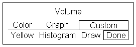
Figure 55
Custom Aspen Formula:
You can make reference to Volume values by using the $1.volume quote code in formulas, color rules and alarms as shown in the following examples.
Color Rule Example:
If($1.volume>$1.volume[1],clr_purple,if($1.volume<$1.volume[1],clr_red,clr_yellow))
This color rule will turn the bar purple if the volume for that bar is greater than the previous bar and red if it is less than the previous bar.
Alarm Example:
chart((spm7.volume>=rmax(spm7.volume,21))[-1],1,2,100,1,1)
This alarm will trigger when the daily volume reaches or exceeds the highest volume of past 21 days.
Volume Accumulation Oscillator
Top of PageWhat it Does:
The Volume Accumulation Oscillator combines the On Balance Volume and Accumulation/Distribution Oscillator studies into one oscillator. It assigns a proportional amount of volume to a period depending on where the close falls in the total range of prices.
This study assigns all volume to buying or selling only if the close is the high or the low for the period.
Type of Study |
Keyboard Command |
It works best in...… |
| Activity Indicator | .vao | Cash, Futures, and Options markets in all time frames and all market conditions. |
Table 33
How Aspen Calculates It:
The Volume Accumulation Oscillator is:
(Close-Low) -(High-Close) * Volume
(High-Low)
Once this is calculated, a 10-period moving average of this value is subtracted from three-period moving average.
Default Parameters Settings:
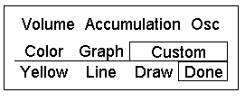
Figure 56
Custom Aspen Formula:
VAOsc(series)=savg($1.volume*(($1.close-$1.low)-($1.high-$1.close))/ ($1.high-$1.low),3)- savg($1.volume*(($1.close-$1.low)-($1.high-$1.close))/($1.high-$1.low),10)
This formula, once entered in the Formula Listing, allows you to use the Volume Accumulation Oscillator study in color rules and alarms as shown in the following examples.
Color Rule Example:
if(VAOsc($1)>=0,clr_green,clr_red)
This color rule will turn a bar green when the Volume Accumulation Oscillator has a positive value and will turn a bar red when the value is negative.
Alarm Example:
chart((VAOsc(s#)>40000)[-1],1,2,100,1,3)
This alarm will trigger when the Volume Accumulation Oscillator has a value exceeding 40,000. The alarm is based on daily bars of the front month of soybeans.
Charting Setup Idea
Oscillators like the Volume Accumulation Oscillator are sometimes graphed as histograms rather than as line charts. To draw this study as a histogram, see the Charting Setup Idea section at the end of the Acceleration study section.
Top of PageWhat it Does:
The scale in Williams’ %R is reversed from that of the Fast and Slow Stochastics; that is, it runs from -100 to 0. When the %R line is above -20, overbought conditions are said to exist, and when the %R line is below -80, it signals oversold conditions.
The Williams’ %R study is displayed as a single line which often fluctuates dramatically. Values near the top of the scale (closer to zero) indicate market strength, while weakness in the market is signaled by values near the bottom of the scale. As with the other stochastic studies, divergence between this study and price movement can be a warning that a reversal is about to occur.
Type of Study |
Keyboard Command |
It works best in...… |
| Overbought/ Oversold |
.%r | Cash and Futures markets in trading ranges, and in all time frames. |
Table 34
How Aspen Calculates It:
The Williams’ %R study is:
100 * (highest high in n periods - current close)
(lowest low in n periods-highest high in n
periods)
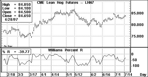
Figure 57
Default Parameters Settings:
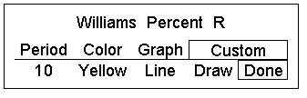
Figure 58
Custom Aspen Formula:
PerCentR(series)=100*(RMAX($1.HIGH,10)-$1.CLOSE)/ (RMIN($1.LOW,10)-RMAX($1.HIGH,10))
This formula, when entered in the Formula Listing, allows you to use the Williams’ %R study in color rules and alarms as shown in the following examples.
Color Rule Example:
if(PerCentR($1)<=-80,clr_green,if(PerCentR($1)>-20,clr_red,clr_yellow))
This three-part color rule will turn a bar green when the Williams’ %R value is under
-80, red when the Williams’ %R value is over -20, and all other bars will turn yellow.
Alarm Example:
chart((PerCentR(dm#)<=-80 or PerCentR(dm#)>=-20)[-1],60,1,100,1,1)
This alarm will trigger when the Williams’ %R value is below -80 or above -20. The alarm is based on hourly bars for the front month of Deutschemarks.