![]()
![]()
|
|
|
|
Aspen offers the following charting techniques:
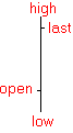
By default, Aspen charts display bars. A bar is a line representing the trading range, with a hash mark on either side representing the open and last (or close):
Traditionally, bars are created temporally--that is, the time base of the chart controls bar formation. In a fifteen minute chart, the trading day is sliced into fifteen minute periods, and the ticks that occur in a given fifteen minute period form the bar for that period. When the fifteen minute period ends, a new bar begins.
Candlestick charts are an ancient Japanese price prediction methodology. Candlesticks date back to the 1700's, when they were used for analyzing rice markets. At that time, Munehisa Homma, a legendary rice trader, gained a huge fortune using candlestick analysis and established candlestick popularity.
Aspen supports candlestick charting. Candles offer an alternate perspective on market data.
|
Up Day |
Down Day |
|
|
|
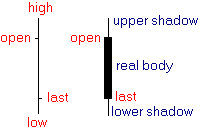
The body of the candlestick is called the real body and represents the range between the open and closing prices. A "black," or filled-in, body represents that the close during that time period was lower than the open. When the body is "white," or hollow, the close is higher than the open.
The thin vertical line above and/or below the real body is called the upper/lower shadow, representing the high/low price extremes for the period.
Candlestick charting involves formation identification.
If you are new to Point & Figure charting and are familiar with bar or candlestick charting, point and figure may appear strange at first. There is no time scale, just columns of Xs and Os. Point & Figure came into popularity long before computers, when all charting was done by hand. As a kind of short hand charting technique, Point & Figure made it possible to update charts on 50 or more instruments in less than an hour.
In Point & Figure charting, Xs represent upward movement and Os represent downward movement. With a set box size and reversal amount (traditionally 1 and 3, respectively), Point & Figure asks two questions, depending on current market direction:
|
X (Up Trend) |
O (Down Trend) |
|
1. Is today's high higher by at least one box size?
|
1. Is today's low lower by at least one box size? |
|
2. Is today's low lower than the difference of the current high less the reversal amount? |
2. Is todays high higher than the sum of the current low plus the reveral amount? |
On any day, one of three things can happen. If the answer to both questions is "no," no action is taken. If the answer to question one is "yes", the current plot is continued. If answer to question two is "yes", reversal occurs.
By removing the time scale, Point & Figure charts remove the noise of insignificant price movement, and support and resistance levels become very apparent.
The easiest way to understand Equal Tick charts is to compare them to traditional bars. A traditional bar is based in time--that is, a fifteen minute chart slices the trading day into fifteen minute periods, and ticks that fall within a particular fifteen minute period contribute to the formation of the respective bar.
By contrast, an Equal Tick bar consists of a fixed number of ticks (regardless of the time they occur). For example, a fifteen tick Equal Tick bar consists of fifteen ticks, and after every fifteen ticks, a new bar is created. (The final bar of the day may consist of one to fifteen ticks.) Naturally, sparsely traded instruments render different time scales than heavily traded instruments, but in either case, a time scale is present.
To display an Equal Tick chart, follow these steps:
Right click on the
chart and choose Properties...
Click the Scale tab.
In the Horizontal
Scale group, open the Width combo box and choose Equal Tick.
In the Horizontal Scale group, set the Ticks field to the number of ticks you want in a bar.

An Equal Tick chart is rendered using data from Aspen's ticks data base.
Futures, by definition, have a limited life. They start trading and expire on a regular basis. The unfortunate result of this reality is that long term technical analysis on a given futures contract is not possible. Continuation charts solve this problem by chaining futures contracts together.
Continuation charts chain futures contracts according to the criteria you set. Aspen provides two continuation methods. You can define the chaining behavior of both methods by right-clicking on a chart and choosing Properties... Click the Continuations tab and modify either one or both of the continuation methods.
For information on displaying Continuations, click here.
Have you ever tried to diversify a securities portfolio and wondered whether two securities trade together? Use a multiple instrument chart to make this judgment.
The
quickest way to create a multiple instrument chart is to click the Add
Instrument icon  in the tool bar. Then type the instrument
you want to add and press Enter.
in the tool bar. Then type the instrument
you want to add and press Enter.
The price scale is a major consideration in multiple instrument plotting. If one instrument trades at 90 and the other at 10, you will see bars drawn along the top and bottom of the chart. This is the normal behavior of linear scaling (which is the default scale of charts). In such cases, you may want to resort to percent change or logarithmic scaling. To change the chart scale, follow these steps:
Right click on the
chart and choose Properties...
Select the scaling you want from the Vertical Scale group.
©2008 Aspen Research Group, Ltd. All rights reserved. Terms of Use.