Using MESA, by John Ehlers
The measured cyclic data can be used two ways:
In the cycle mode, the price level is expected to cross the trend line every
half cycle. If the price fails to cross the trend line within a half cycle,
hold the position until the trend is exhausted. MESA includes four overlays and
two studies. The overlays denote the following:
All cycle predictions are displayed as history over one full cycle period.
This perspective enables you to compare the prediction to the price data and to
project price activity ten bars into the future (from the position of the
vertical cursor).
Predictions are obtained at any point on the bar chart by first moving the
cursor to the desired position on the chart and double clicking the left mouse
key. This feature enables you to back test the prediction. The following figure
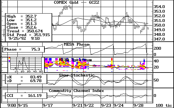
shows the price in the cycle mode with the price alternating about the trend
line approximately every half cycle. This figure also shows the forward
prediction from the cursor position at 11:36 on September 22, 1992, as well as the fit
of the measured dominant cycle to the data for the previous 25 bars.
The frequency of the data is displayed in the MESA Spectrum Study. The spectrum for the
bar on which the cursor is located is displayed as amplitude versus the cycle
length. Each horizontal graduation denotes the amplitude and is half the
amplitude of the next higher graduation. This logarithmic scale enables an amplitude
display over a range of 100:1. The existence of a single cycle is a simple
spike on this display. Several simultaneous cycles appear as multiple spikes with
amplitudes relative to the strongest dominant cycle. More complex cycle
contents appear as wide bell-shaped or distorted curves. Such displays indicated
that the cycle energy is spread across a range of the spectrum and is therefore
not focused at a single cycle. Spectra showing poorly formed cyclic content
commonly appear when the market is in a trend mode. The following figure shows
that the dominant cycle at the cursor location is 25 bars. There is also a very
low level 9 bar cycle present in the data.
The amplitude axis of the spectrum display is color coded, with the highest amplitude
graduation being yellow. The colors usually vary. Higher amplitudes are lighter
while lower amplitudes are darker. These colors can be displayed below the bar
chart on a split screen. Displaying the study in a split window aligns the
spectrum with the bar chart. The vertical axis of the spectrum contour is the
length of the cycle period. The cyclic history is apparent at a glance. The
formation of the cycle length varies as a function of time, and cycles have
distinctive patterns. A sharp contour indicates a well-defined cycle while splotches
of bright colors indicate that the cycle energy is spread across the spectrum.
The averaged length of the dominant cycle is shown as a green line in the cycle
contour display. The following figure shows that the measured dominant cycle
is consistent in the vicinity of the cursor.
The second MESA study displays the phase angle of the dominant cycle you
measure. The phase of a pure cycle increases smoothly from 0 degrees to 360
degrees, and then begins at 0 degrees again for the next cycle. The following figure
show the relatively smooth phase of the measured dominant cycle when the market
is in a cycle mode.
The smoothness of the phase angle
A sine wave has an amplitude peak when the phase angle is 90 degrees and an
amplitude minimum when the phase angle is 270 degrees. The phase display enables
you to anticipate these cycle turning points. For example, if the dominant
cycle has a 20 bar period, the rate-of-change of phase is 18 (360/20) degrees per
bar. Therefore, to make an entry exactly at the lowest cyclic point, a trade
decision should be made when the phase angle is 252 (270-18) degrees.
Cycle predictions are valid only when the stationary constraint is met, making the cycle consistent over the observation window. The MESA
observation window is 30 bars for each measurement. Since the observation window
is fixed, it is possible to alter the data to satisfy the constraint. Success
is judged by the resulting output. The most consistent cycle is a pure sine
wave of un-changing amplitude and frequency. On the spectrum contour plot, a
consistent cycle appears as a single horizontal yellow line at a single
frequency. It is often possible to approach this ideal condition by using the
compression feature to alter the data. For example, starting with a split screen tick
chart, compress the tick bars by entering the .EQTICKS 5 command and examine the
spectrum contour. You can also observe other compressions by entering
.EQTICKS 10, .EQTICKS 20, and so on. Since different data appears in the observation
window with each compression, MESA often produces a nearly straight, horizontal
dominant cycle period in the spectrum contour. As a practical matter, it is
best to set the dominant cycle length to less than 25 bars. The following
figure is a tick chart that has been compressed to 100 ticks to produce the best
cyclic performance, as indicated by the well-defined horizontal spectrum contour
display. Compressing to produce the best cycle modes produces the best phase
display and the best cyclic predictions.
To identify the optimum cycle mode, you can also compress the time scale. For
example, you can compress the time scale by changing a 1 minute bar chart to a
5 minute bar.
Having achieved a reasonably solid dominant cycle display by compression, the
market will most likely be in cycle mode. When a market is in cycle mode, the
probability that the predicted cycle turning points and phase displays are
accurate is increased. Additionally, you can verify trade signals by looking at
cycle-sensitive indicators like the Slow Stochastic and the Commodity Channel
Index. The following figure shows the same 100 tick compressed display with a
slow stochastic and CCI. The prediction, phase angle, slow stochastic, and CCI
all indicate a selling opportunity at the cursor location. Buy and sell
opportunities can be correlated at other positions on the screen.
Topics:
Topics:
![]() First, the cyclic turning points can be predicted under the assumption that
the measured cycle will continue into the future. The prediction allows
anticipation of buy and sell points when the market is in a cycle mode.
First, the cyclic turning points can be predicted under the assumption that
the measured cycle will continue into the future. The prediction allows
anticipation of buy and sell points when the market is in a cycle mode.
![]() Second, the cyclic component can be removed from the data to leave the trend
line as a residual. A trading strategy can be established by observing the
price action relative to the trend line.
Second, the cyclic component can be removed from the data to leave the trend
line as a residual. A trading strategy can be established by observing the
price action relative to the trend line.
![]() The first overlay is the MESA trend line. The remaining three overlays are
price predictions:
The first overlay is the MESA trend line. The remaining three overlays are
price predictions:
![]() The second overlay is the most commonly used prediction and is based on the
measured dominant cycle.
The second overlay is the most commonly used prediction and is based on the
measured dominant cycle.
![]() The third overlay is the second prediction, based on a sine wave cycle that
best fits the data over the cycle lengths from 6 to 50 bars.
The third overlay is the second prediction, based on a sine wave cycle that
best fits the data over the cycle lengths from 6 to 50 bars.
![]() The fourth overlay is the third prediction, based on a sine wave cycle period
you select.
The fourth overlay is the third prediction, based on a sine wave cycle period
you select.